Introduction
The Paper Boat Poster Series was my very first assignment in graphic design, giving me the opportunity to explore creativity and understand the process of visual communication. I chose Paper Boat as the brand for this project because of its strong association with nostalgia, childhood memories, and its unique positioning in the beverage industry.
Posters that Speak
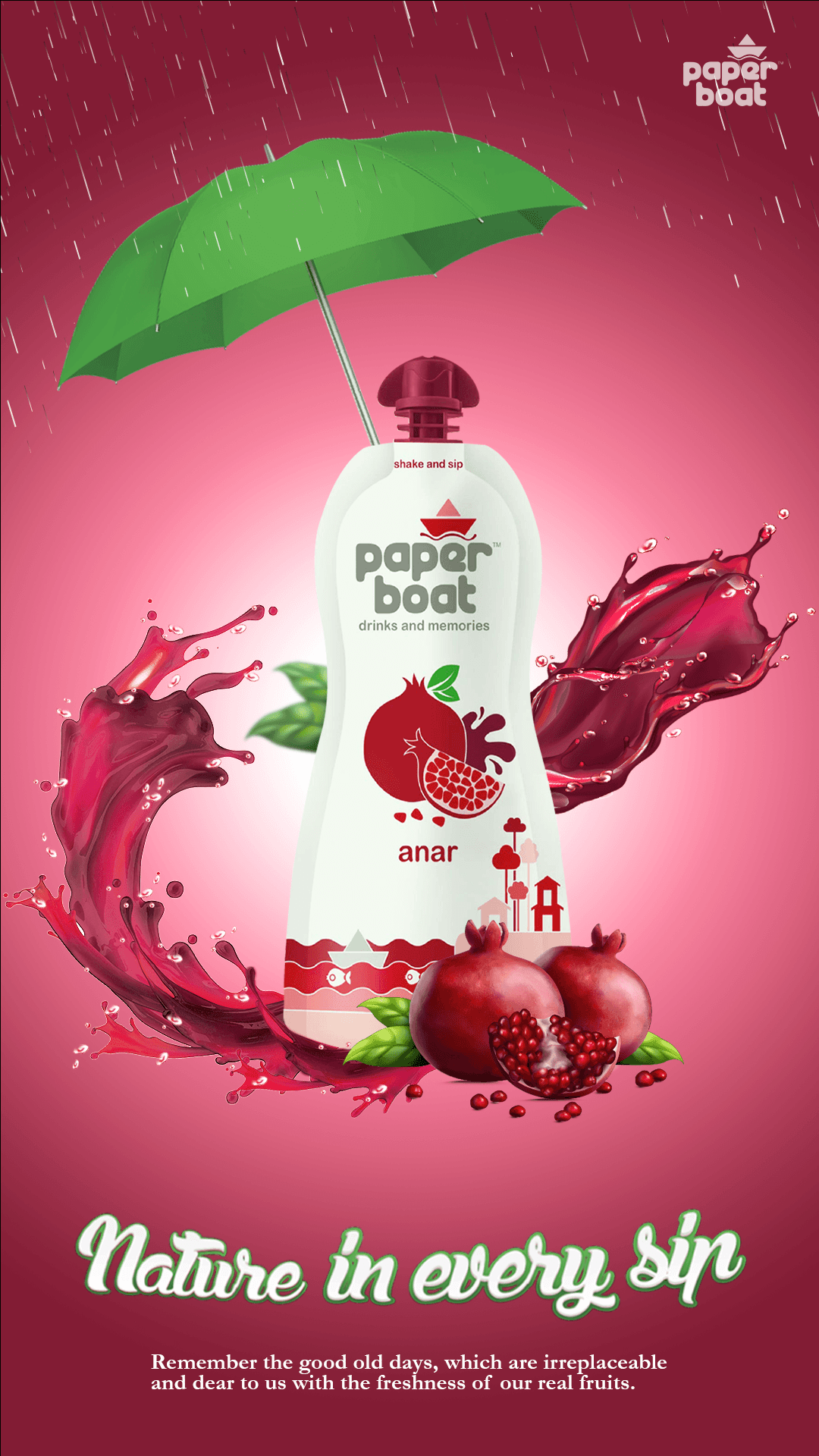
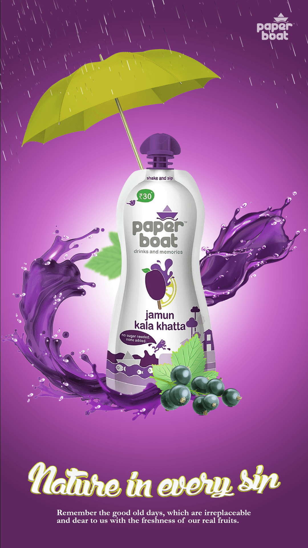
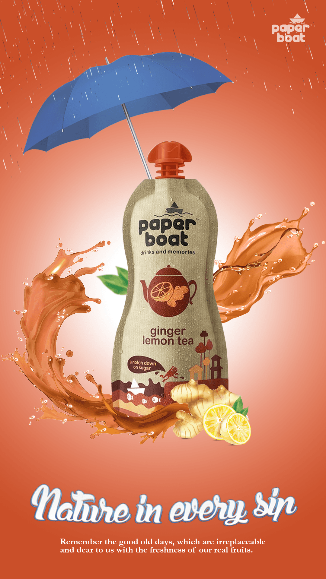
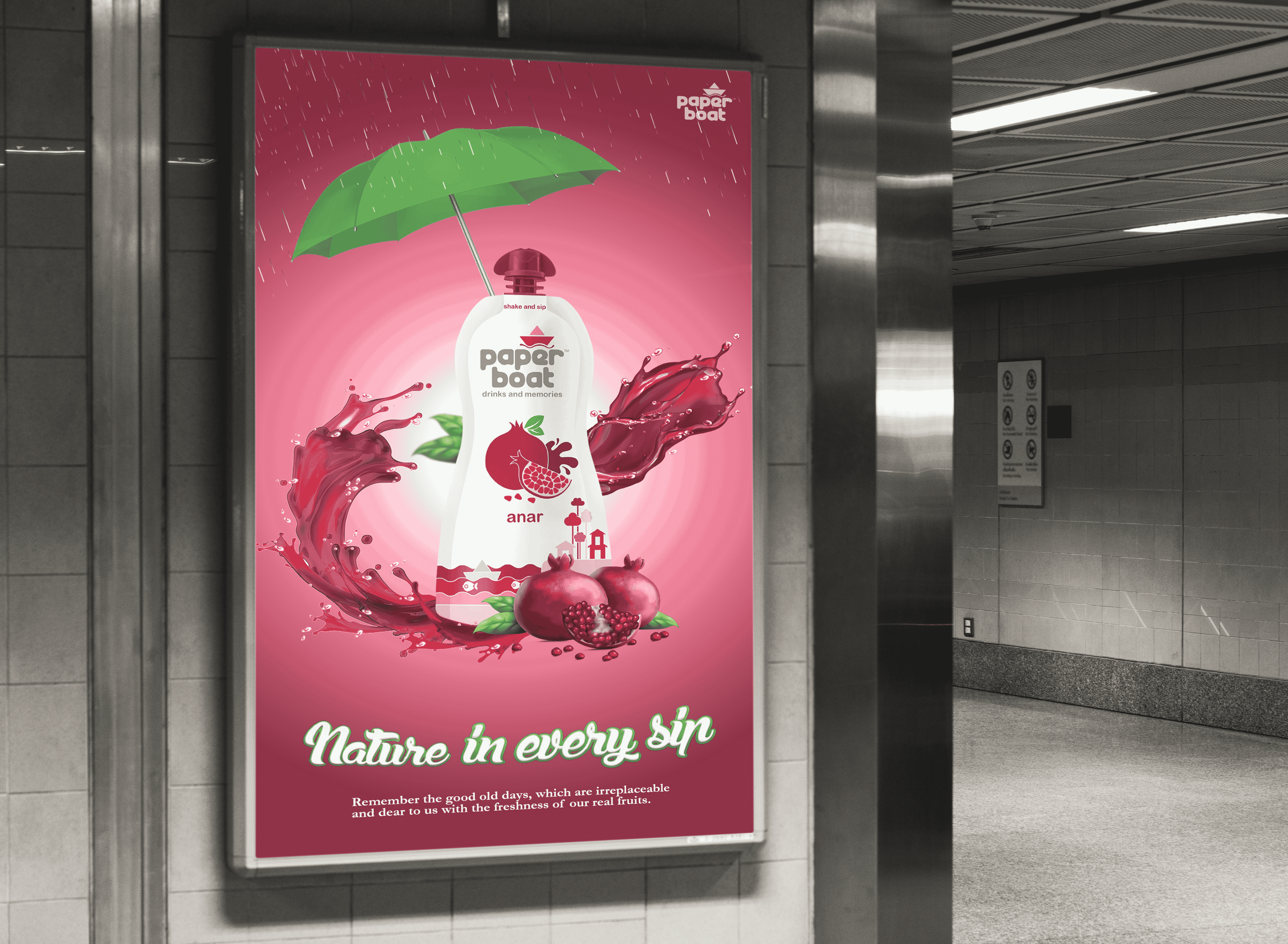
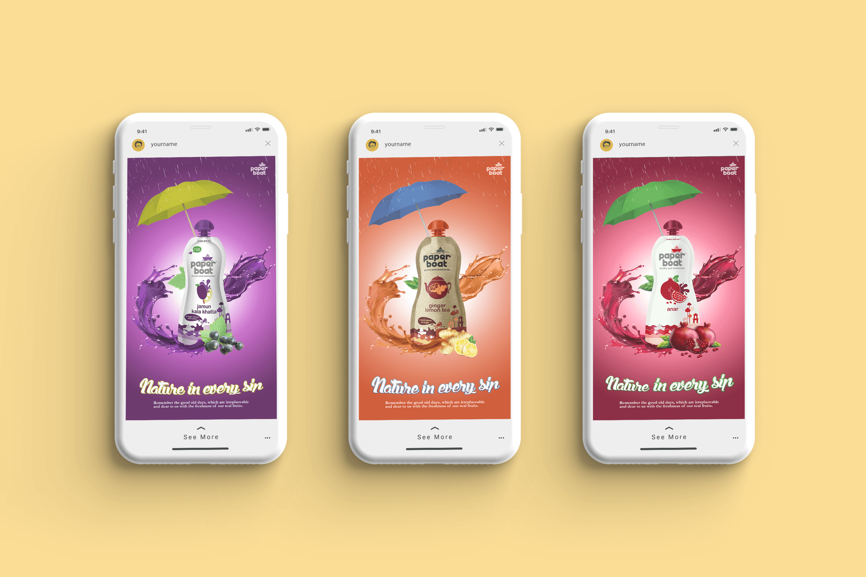
Monsoon Posters
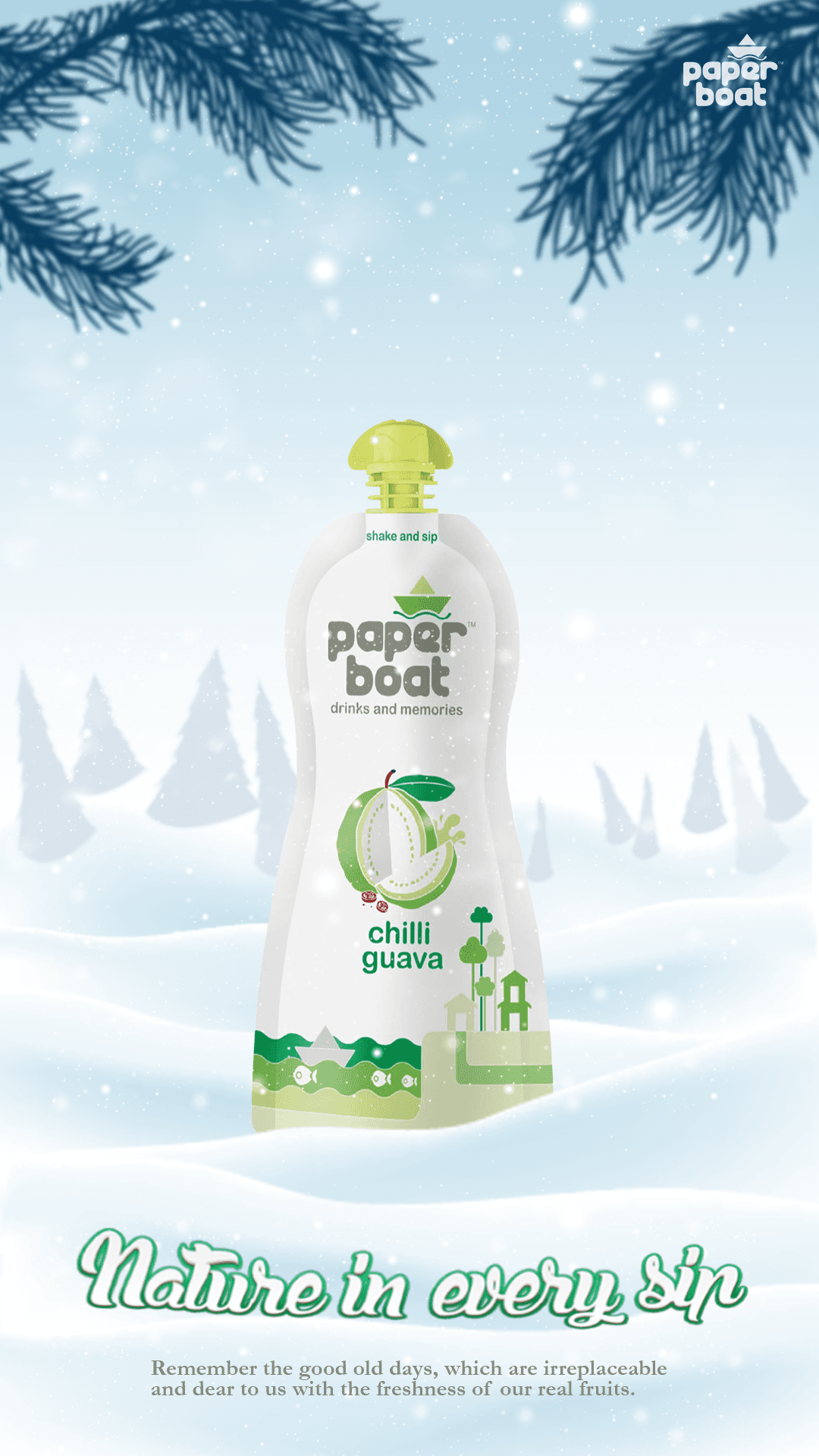
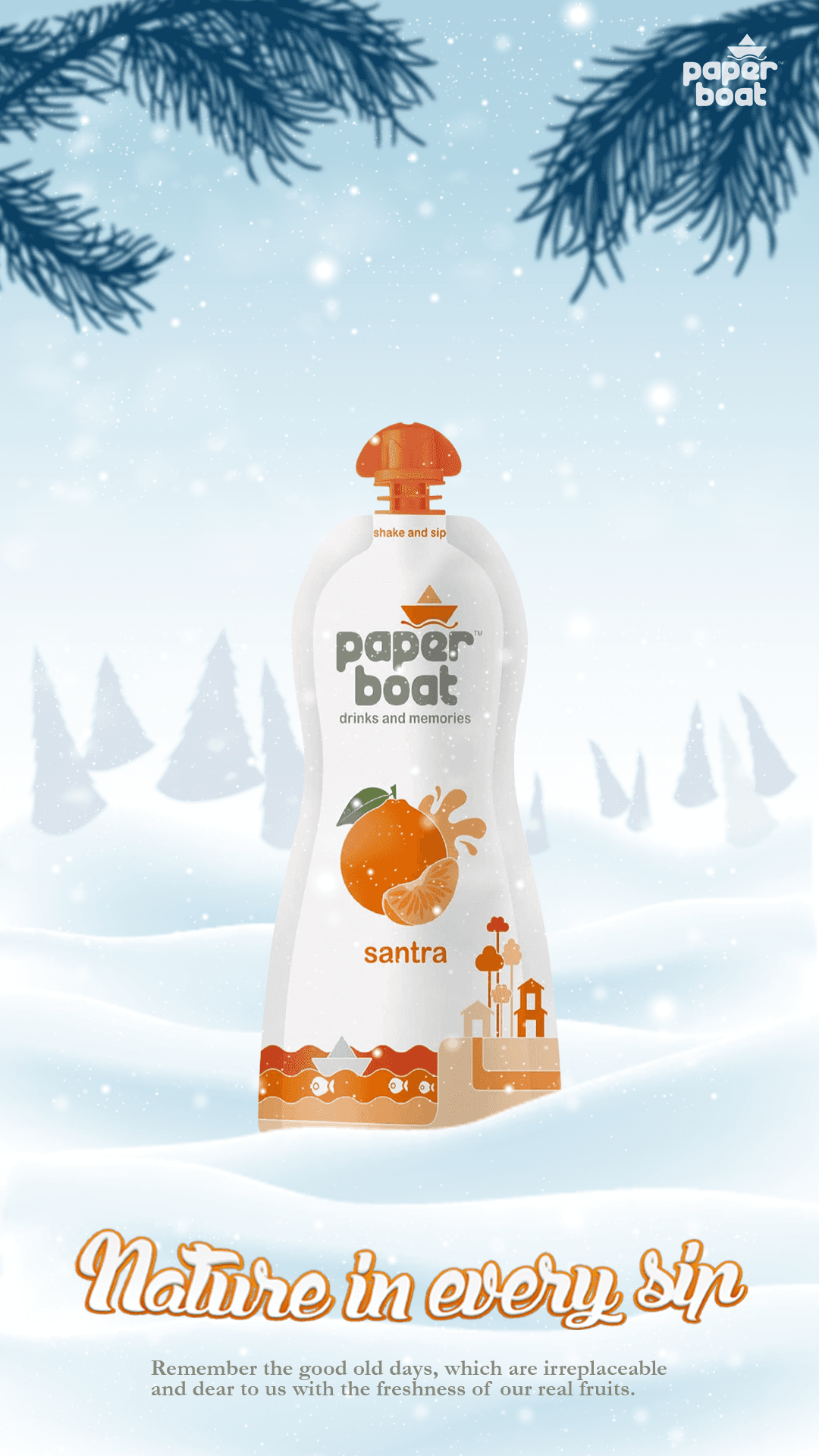
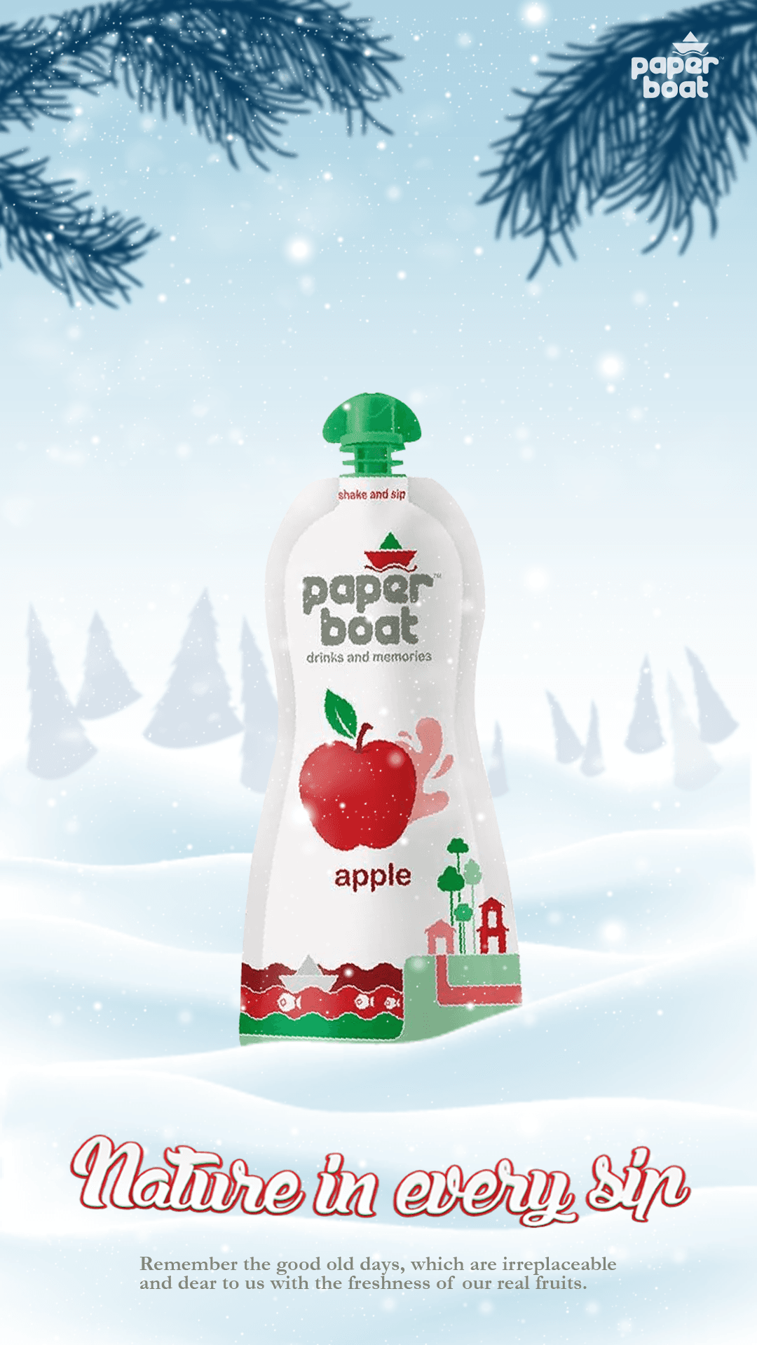
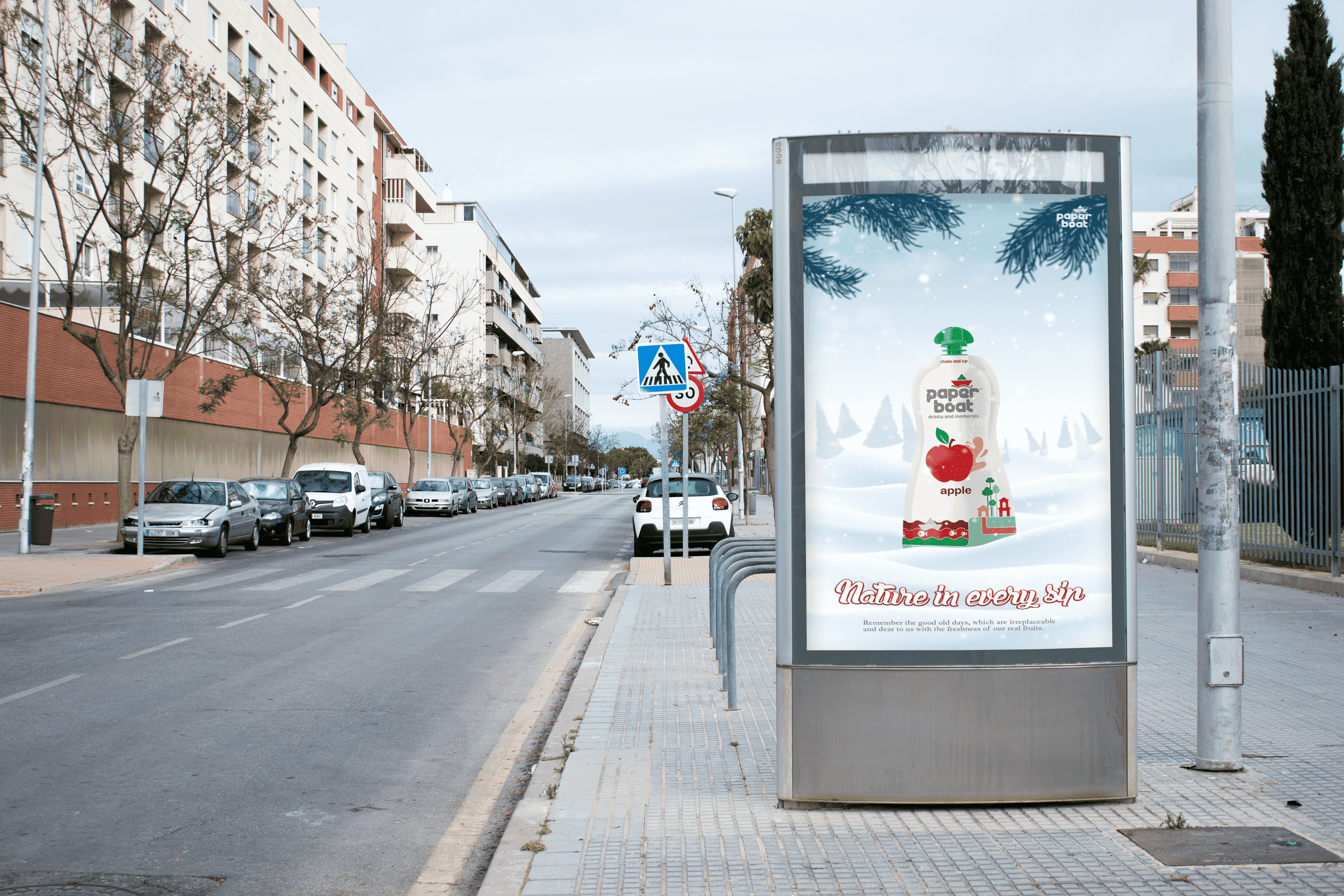
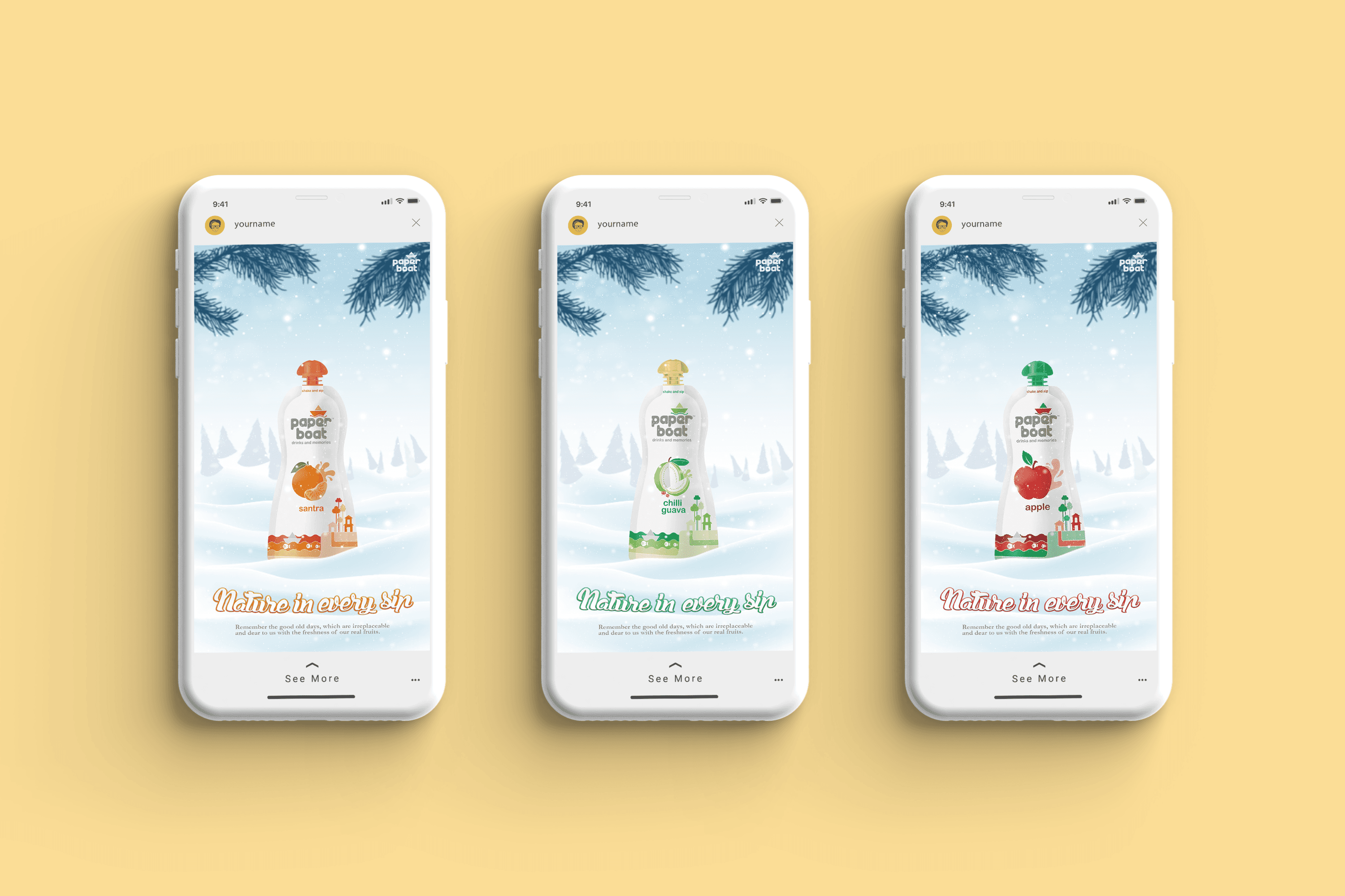
Winter Posters
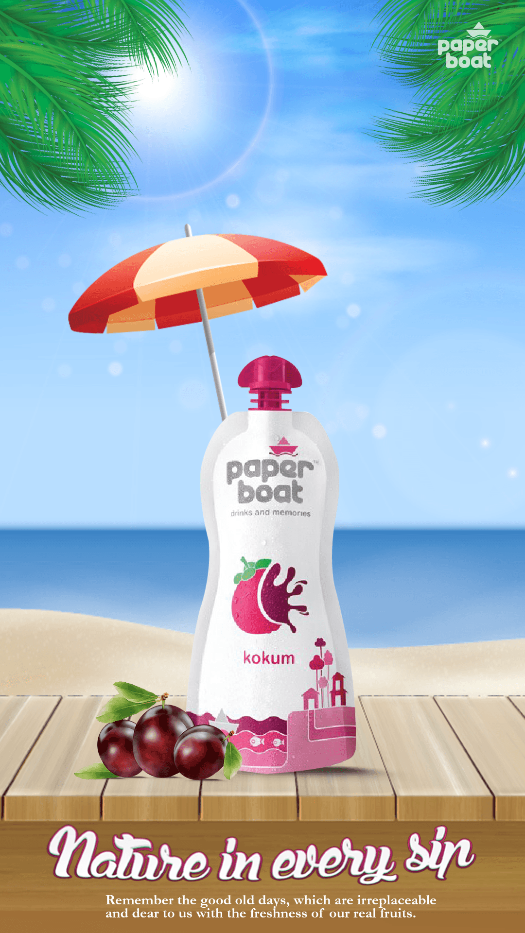
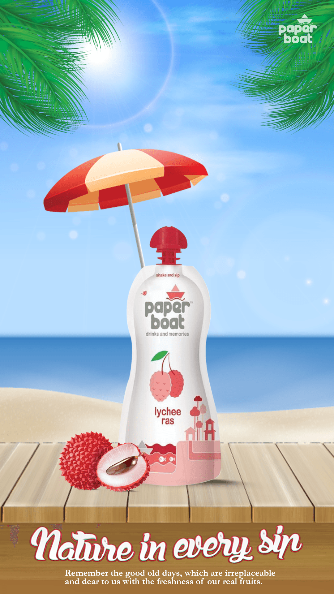
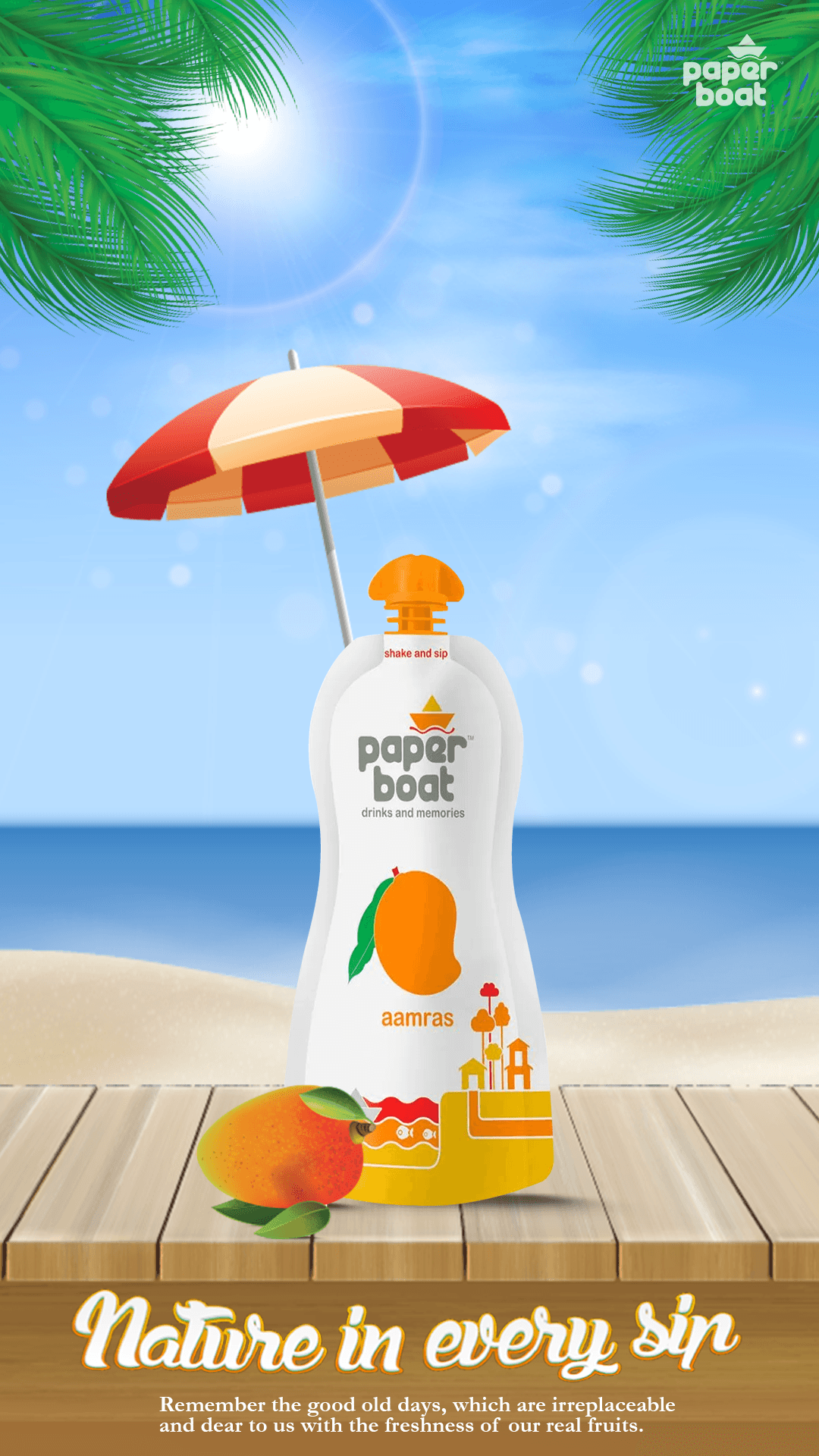
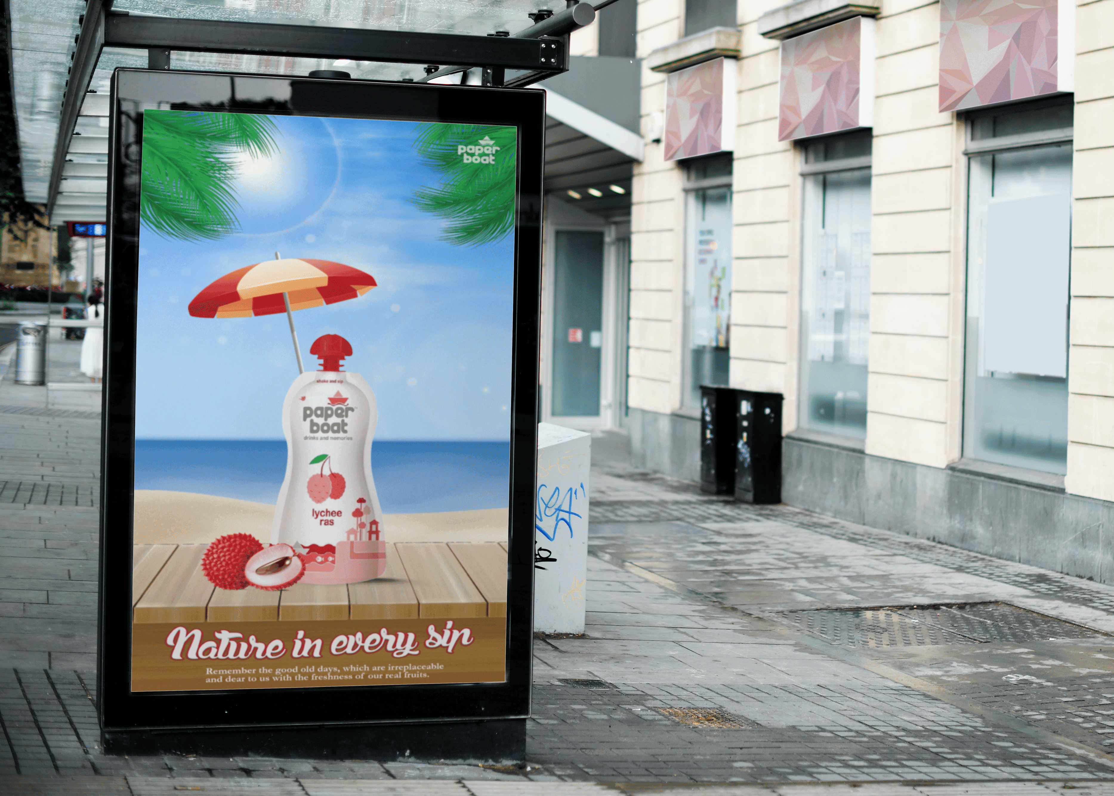
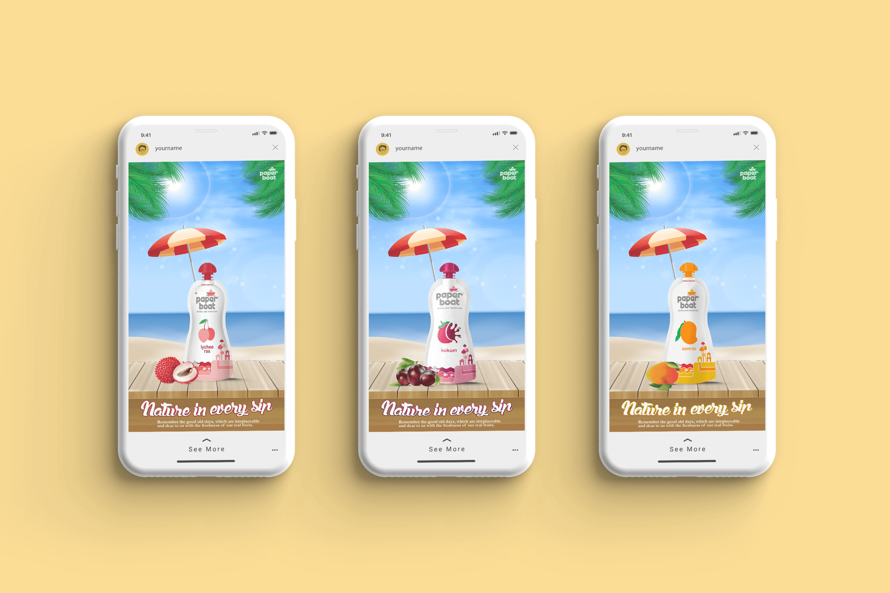
Summer Posters
Why Paper Boat?
A Nostalgic Dive into the Brand
When tasked with my first graphic design assignment, I sought a brand that resonated with emotions and connected deeply with its audience. Paper Boat stood out for its unique focus on nostalgia and childhood memories, encapsulated in their tagline, "Drinks and Memories." The brand’s association with traditional Indian drinks and simple pleasures made it a perfect choice to experiment with poster design.
User Study
Understanding the target audience was crucial. I conducted a small-scale user study to explore how people associated Paper Boat with seasonal beverages and memories. The study concluded as:
Paper Boat's target market is people between the age groups of 20 and above, as the concept is to bring childhood memories back.
Primarily people born in the 90s.
Invoking nostalgia in people through their freshly made drinks.
The Design Strategy
With the brand’s essence and audience insights in mind, I formulated the design strategy:
Theme: Celebrate seasons with vibrant illustrations of fresh fruits.
Tone: Playful, nostalgic, and visually appealing.
Focus: Highlight three core seasons (summer, monsoon, winter) with three unique posters each.
Written Copy
Crafting headlines and body copy required brainstorming multiple options. After iterations and feedback, the final set was chosen:
Headline
Body Copy
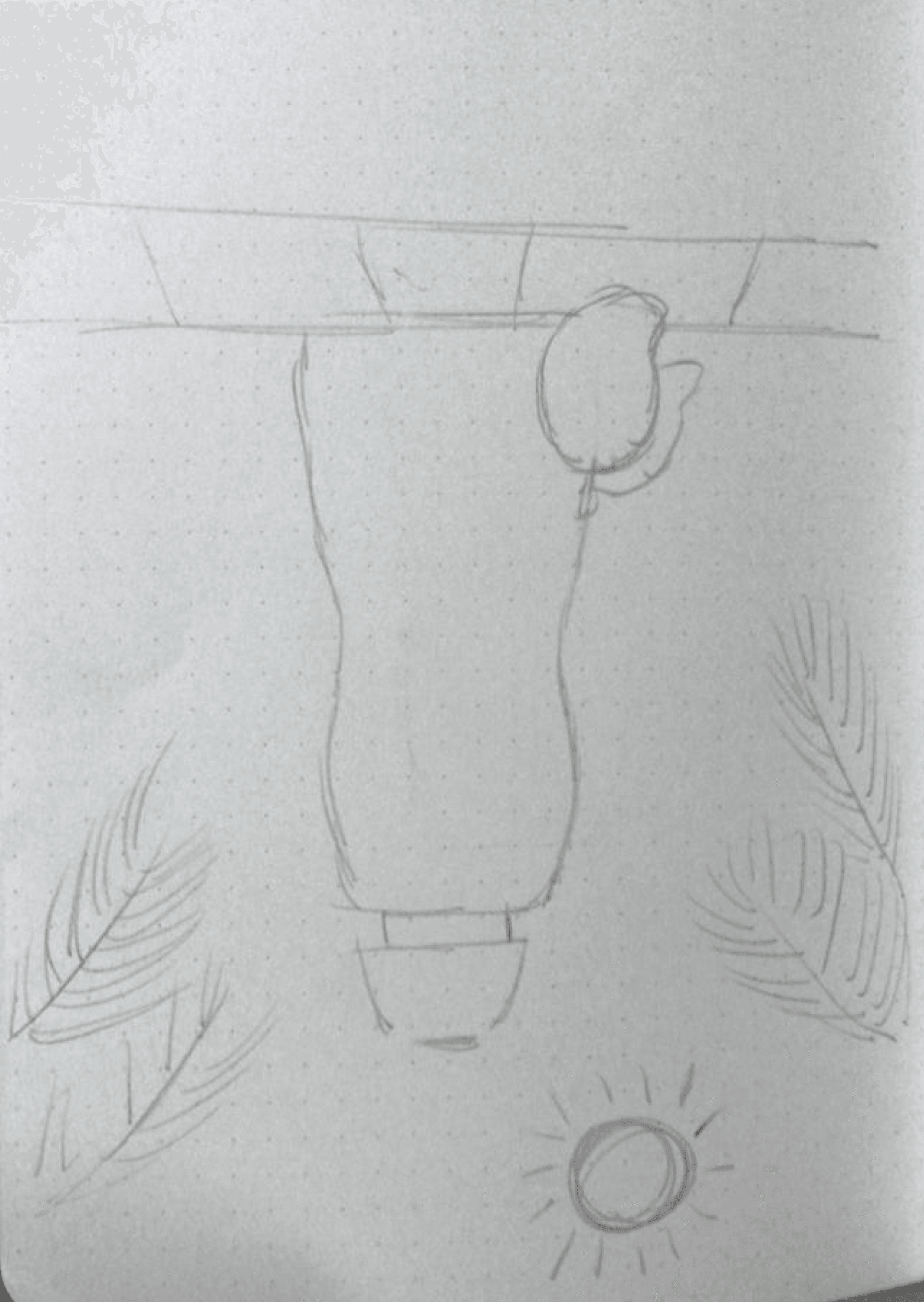
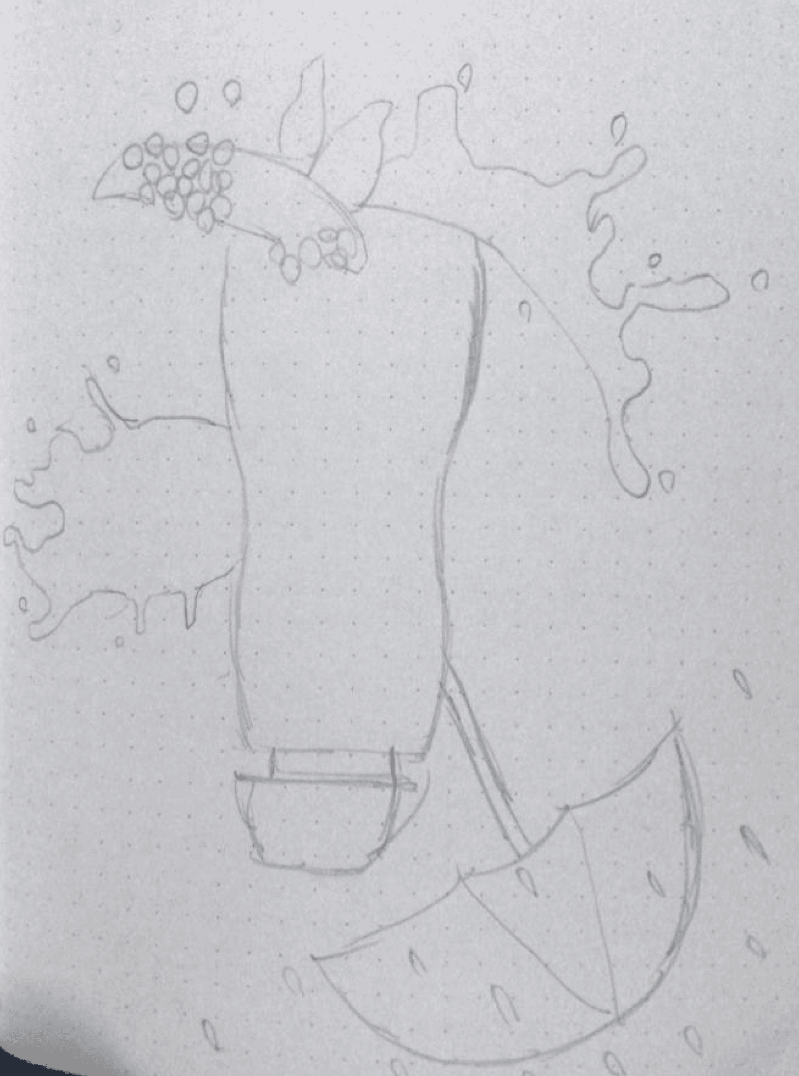
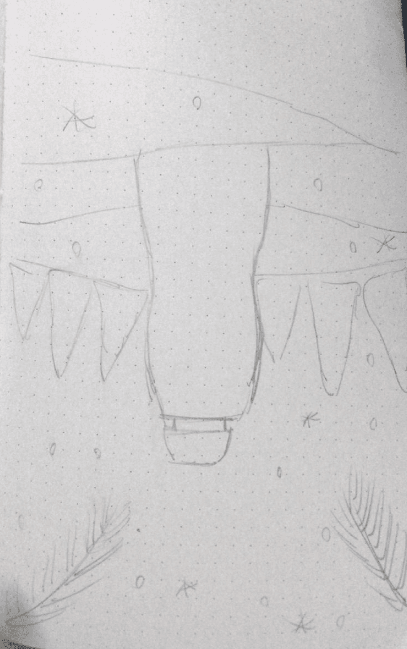
The Sketching Phase
Concept sketches formed the foundation of the designs. For each season, multiple rough sketches were created, exploring different compositions, elements, and layouts. After several iterations, one concept for each season was finalized:
Incorporating umbrellas, raindrops, and splashes to evoke the joy of rainy days. Splashes indicate the puddles formed after it rains, which added a playful touch.
Featuring snowflakes, pine trees, and cozy elements to represent the chilly yet festive winter vibe.
Highlighting sunny beaches, podiums, and rays of sunlight to capture the essence of summer and its scorching heat.
The Final Deliverables
Outcomes: A Series That Tells Stories
The project resulted in nine visually striking posters—three for each season—that effectively tied Paper Boat’s brand identity to seasonal nostalgia. The series captured the emotional essence of each season while highlighting the freshness and simplicity of the drinks.
Wrapping It Up
This project marked the beginning of my journey in graphic design, blending creativity with strategy. The Paper Boat Poster Series was more than just an assignment; it was an opportunity to explore storytelling through visuals. This project taught me how design can bridge the gap between a product and its audience through relatable and visually appealing stories. This experience continues to inspire my approach to creating meaningful, user-centered designs.