IRCTC
Redesign Case Study
Introduction
The Indian Railway Catering and Tourism Corporation (IRCTC) app is a critical tool for millions of users booking train tickets and accessing railway services. However, its user experience has often been criticized for being complex and outdated. This redesign project aimed to address these issues by creating a user-friendly, intuitive, and efficient app that caters to diverse user needs.
Dive Into the Details
Homepage
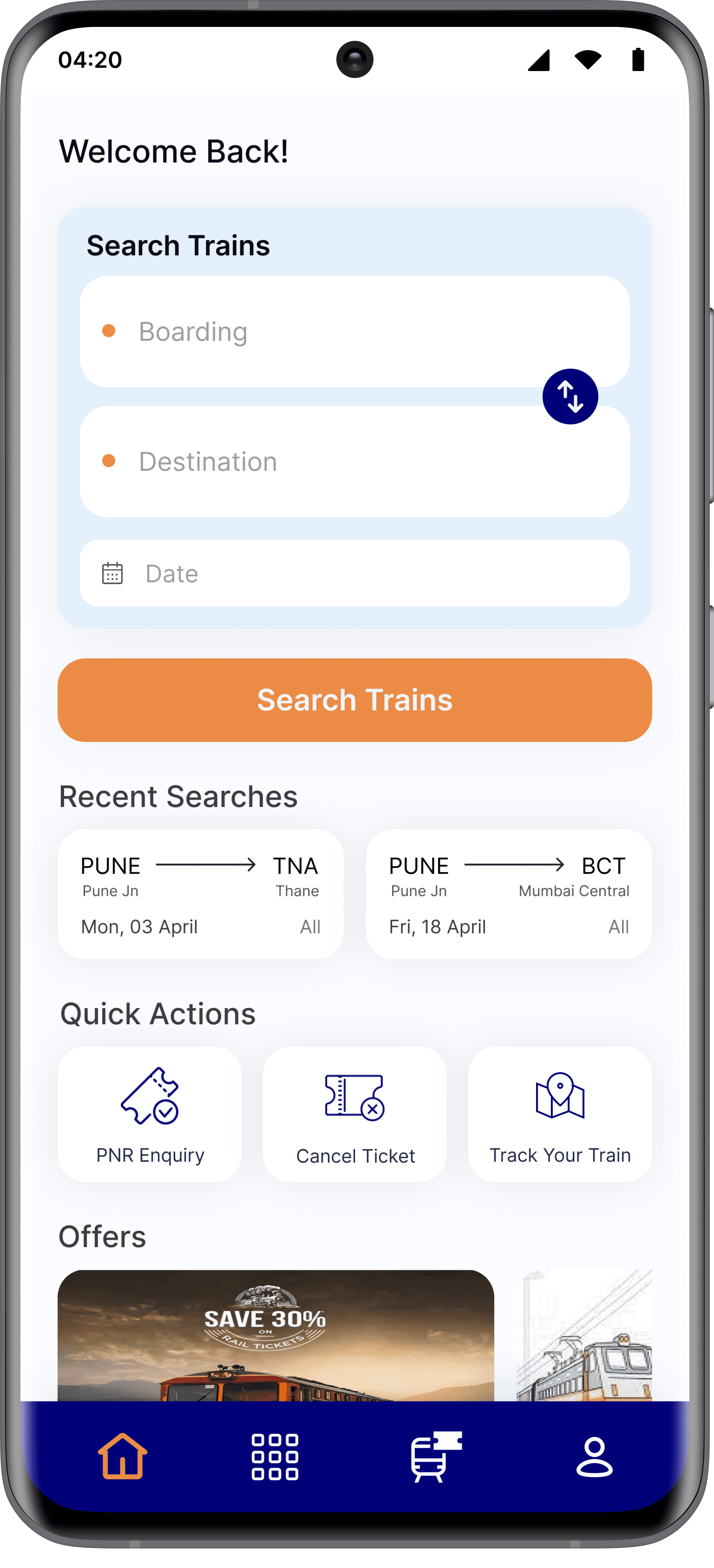
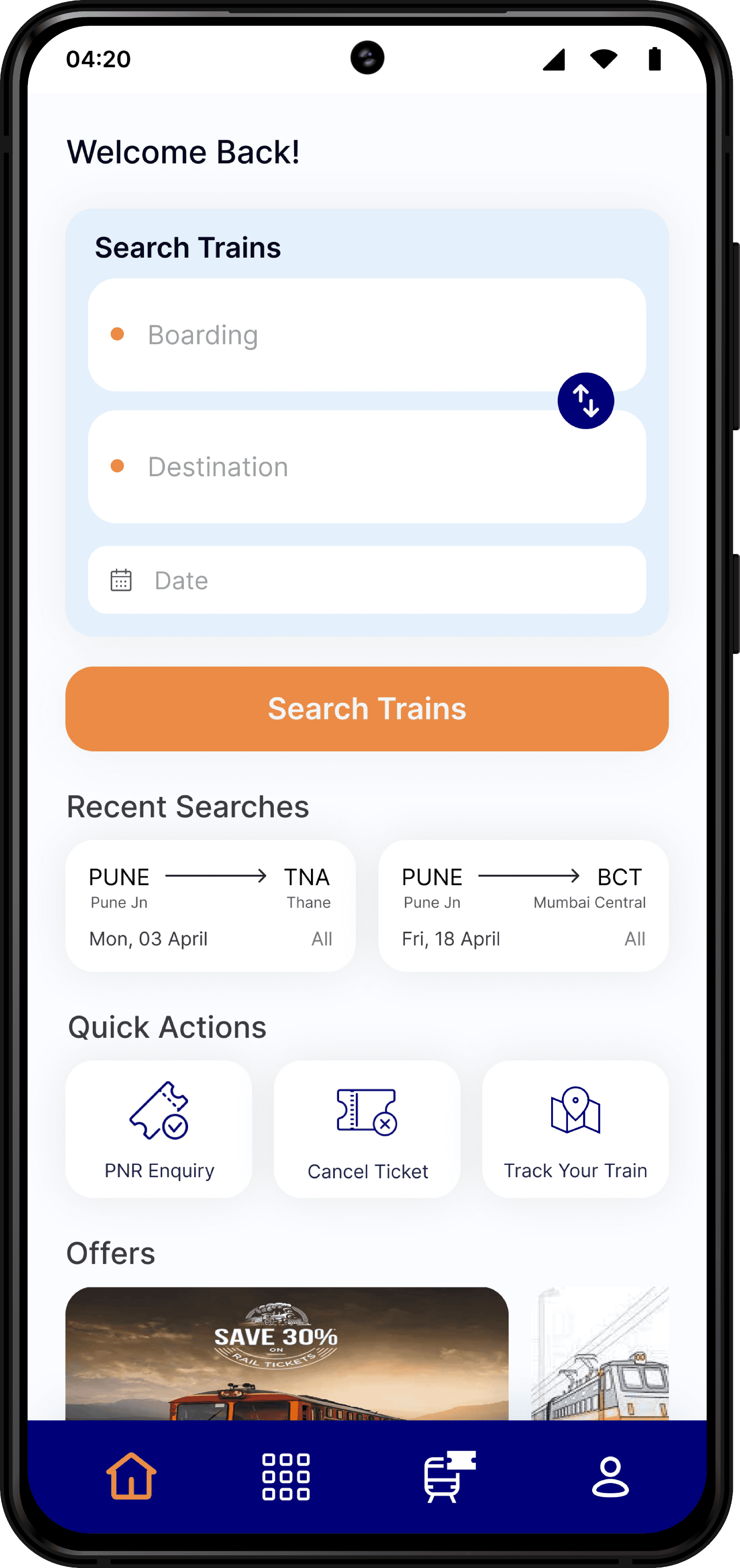
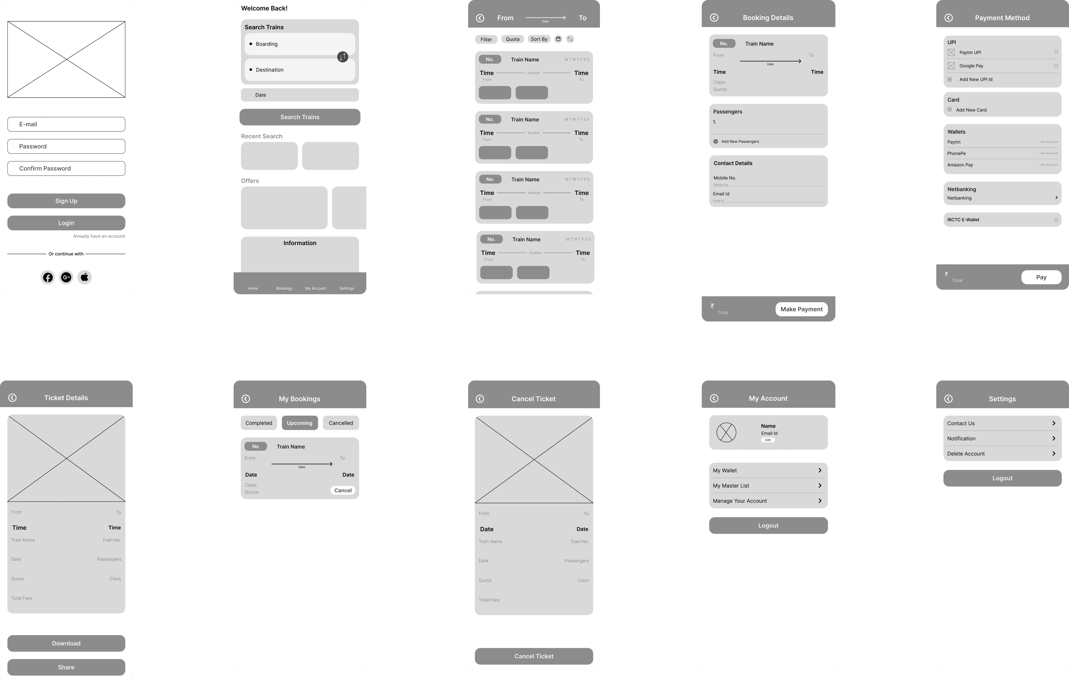
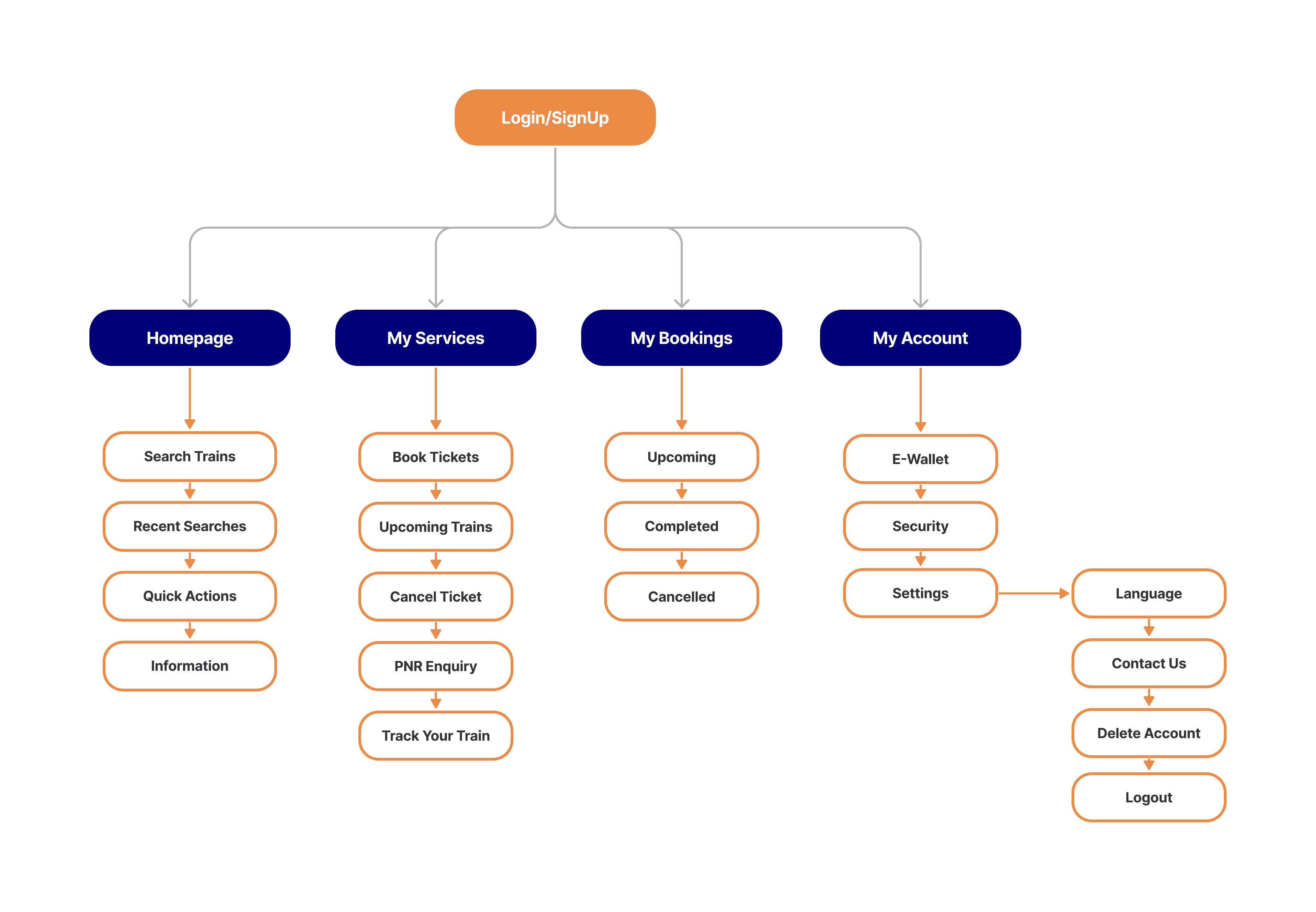
Users can search trains by inputting boarding and destination stations and applying filters like date, class, and type. Quick actions, including PNR inquiry, cancel ticket, and track your train, are prominently displayed.
Booking Process
The revamped booking process is smooth and intuitive:
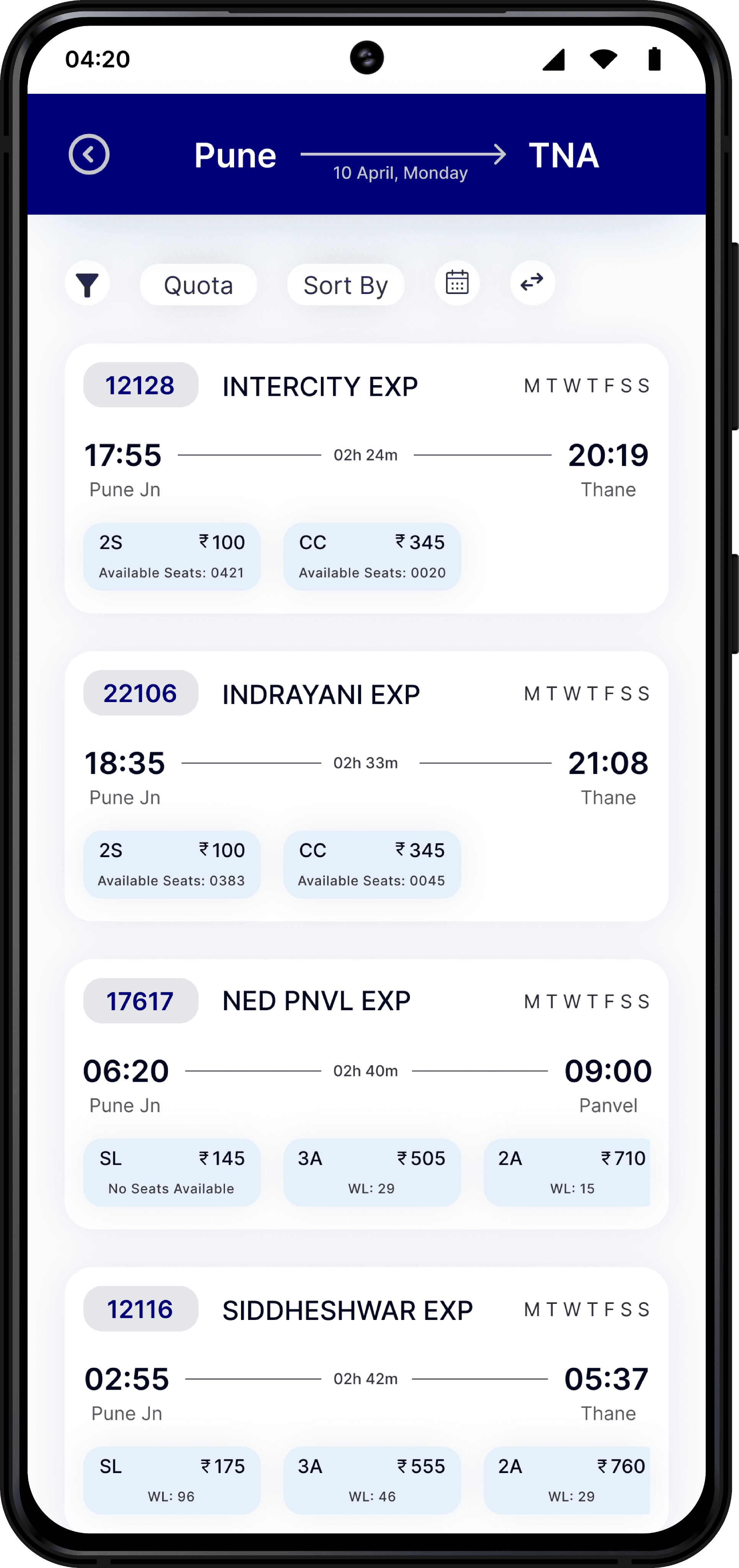
Search results are displayed in a clean format.
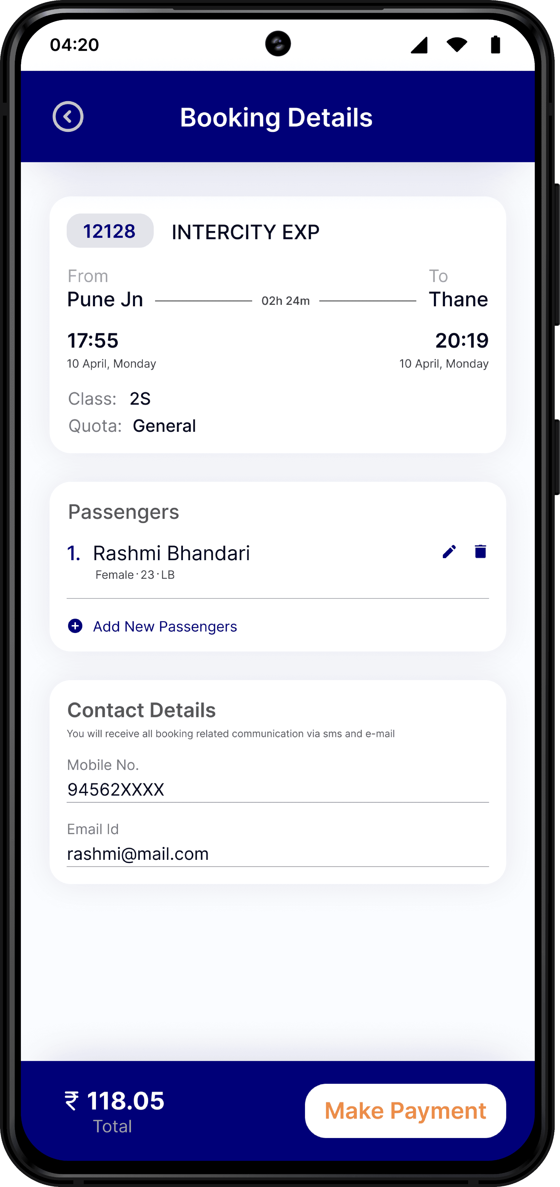
After selecting a train, users fill out booking details such as passenger count and contact information.
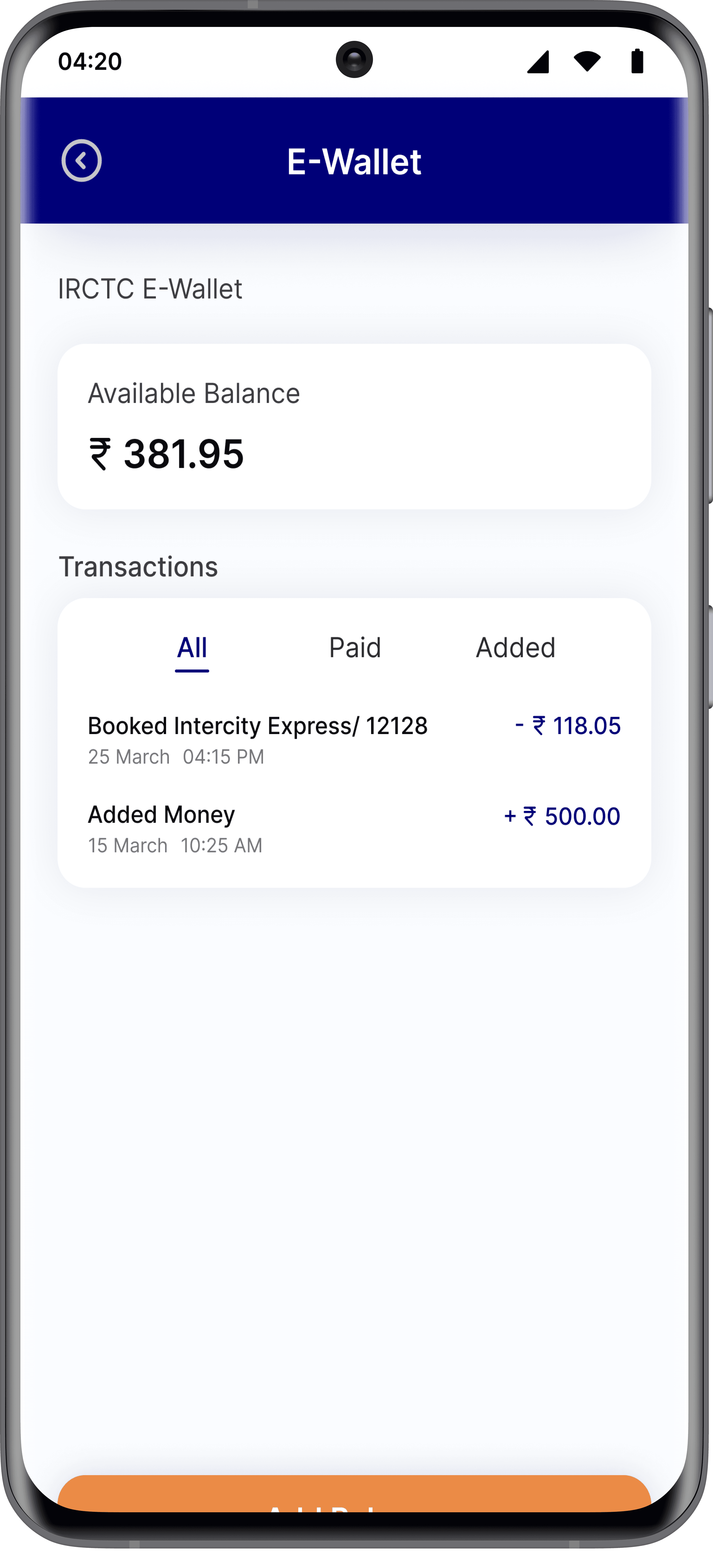
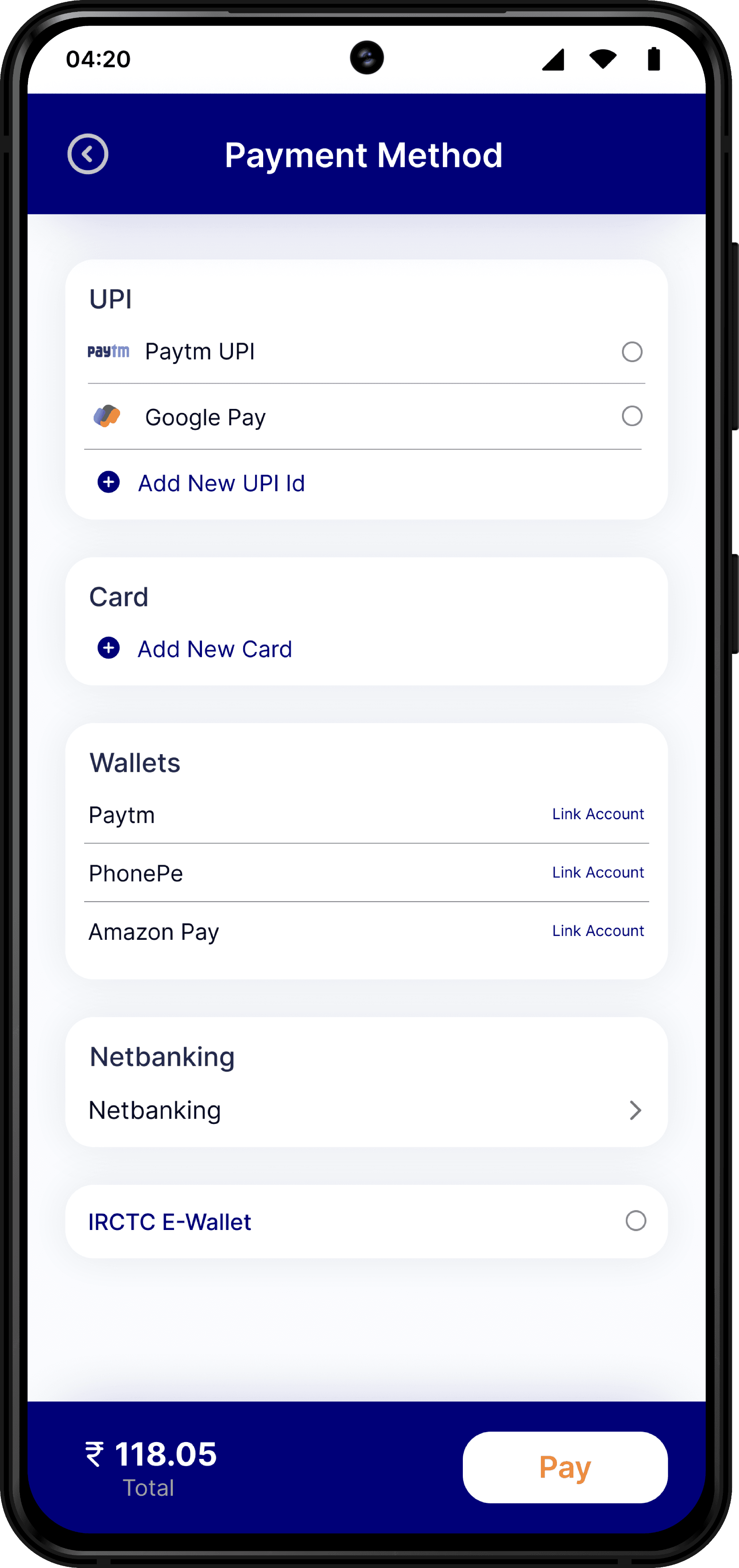
Payments can be made using various options like UPI, cards, net banking, and wallets.
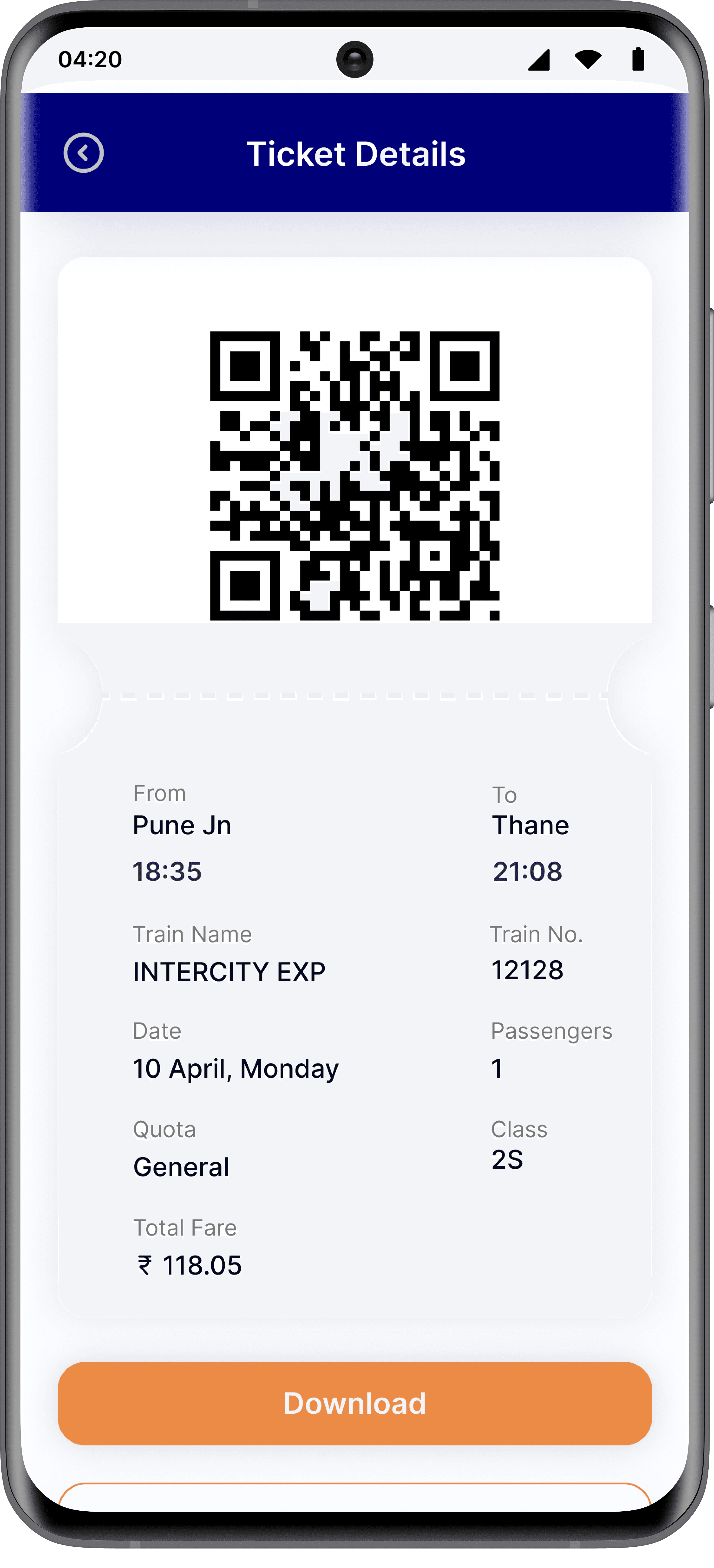
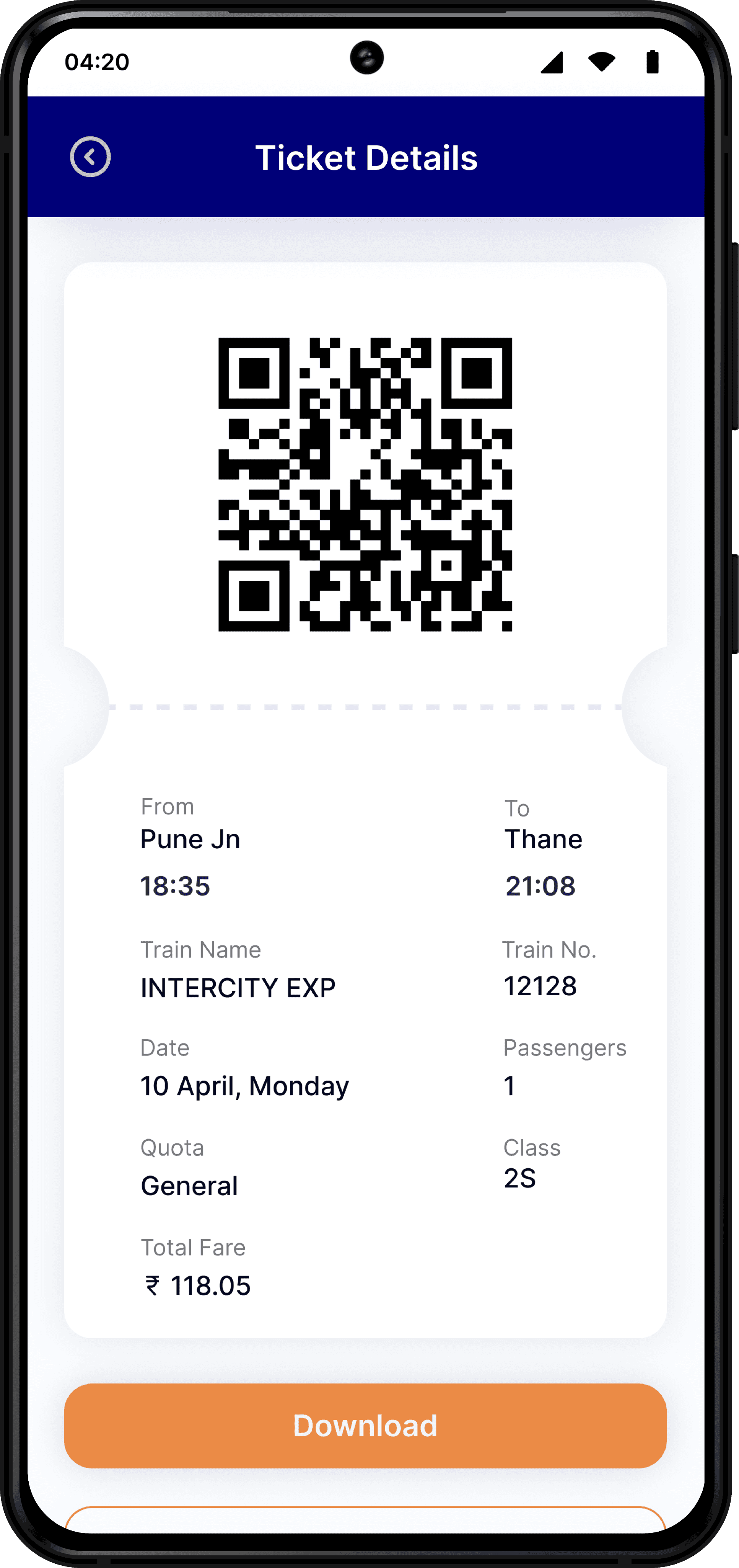
A receipt with ticket details is instantly generated post-payment.
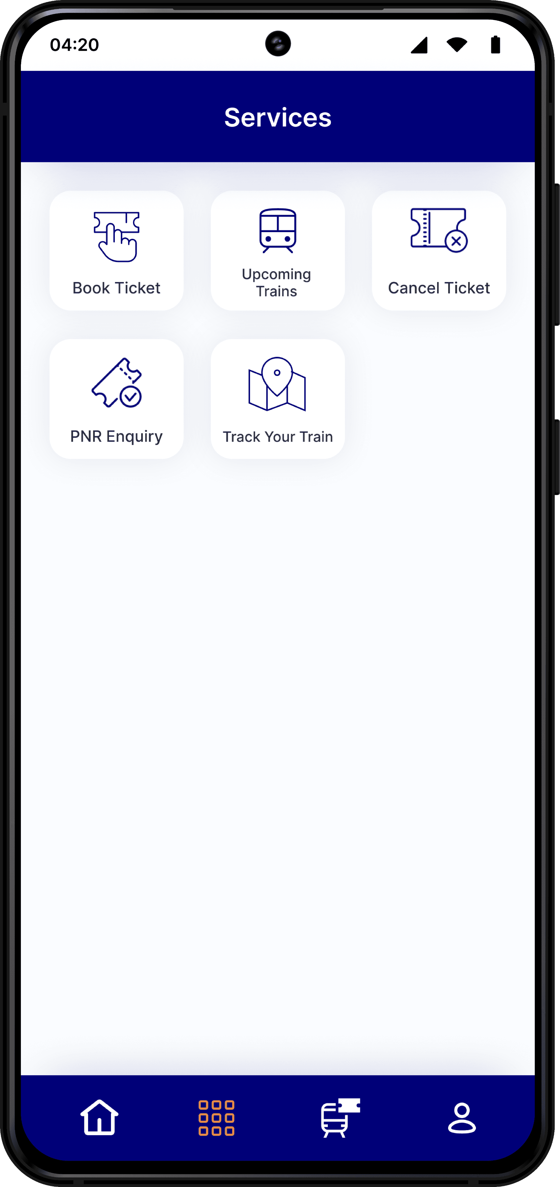
Services
This section includes essential options:
Book Ticket
Upcoming Trains
Cancel Ticket
PNR Inquiry
Track Your Train
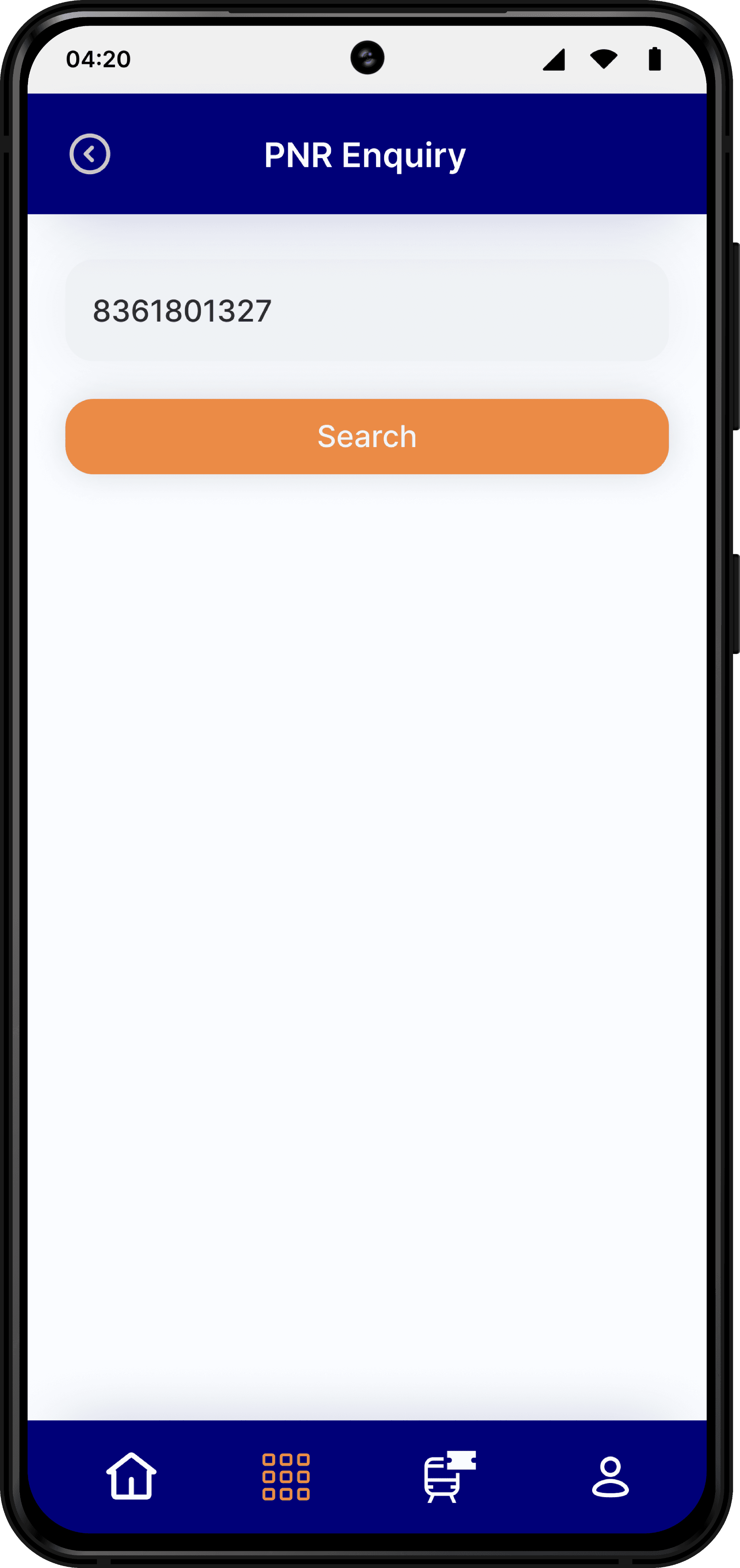
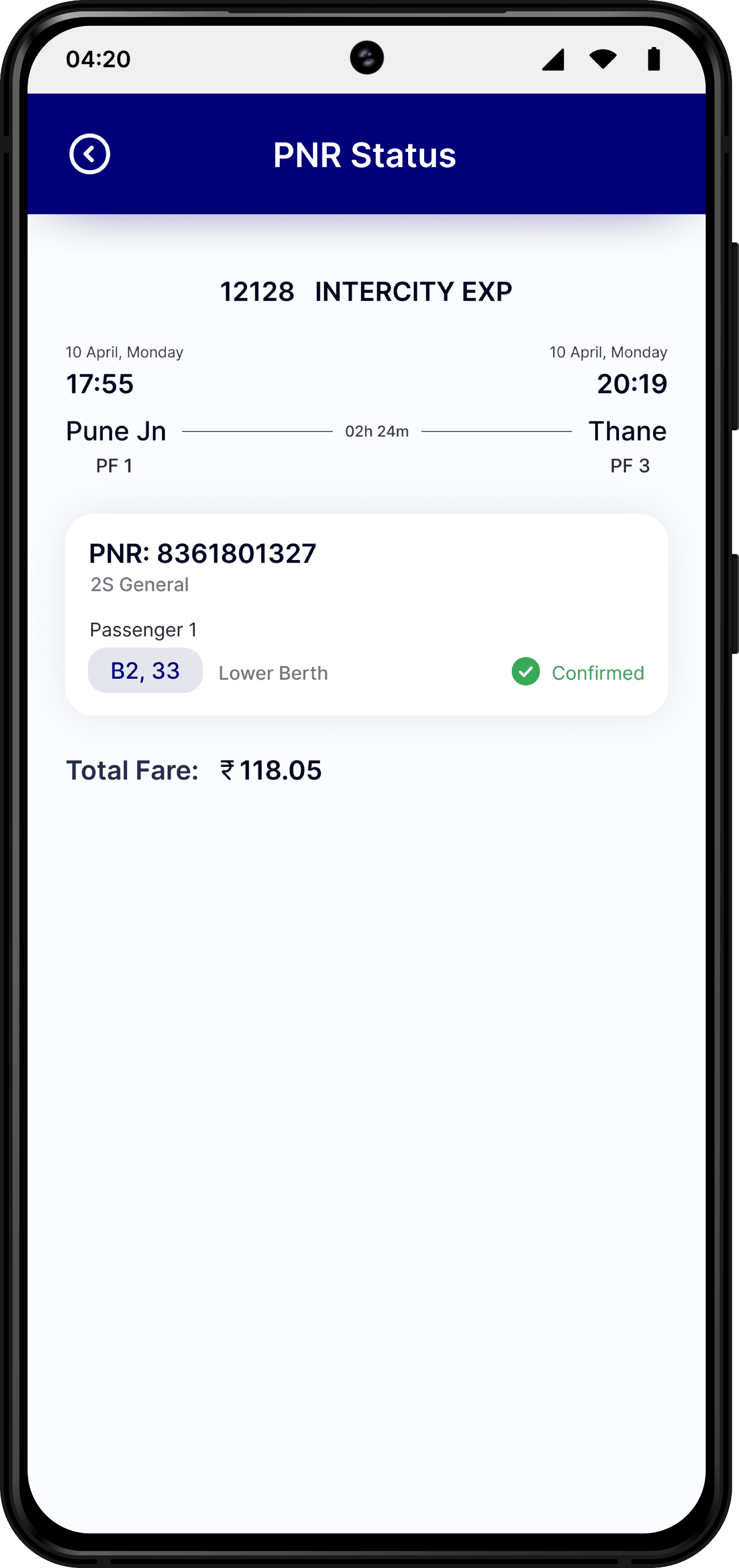
PNR Enquiry
Users enter their PNR number to quickly retrieve booking details and train status.
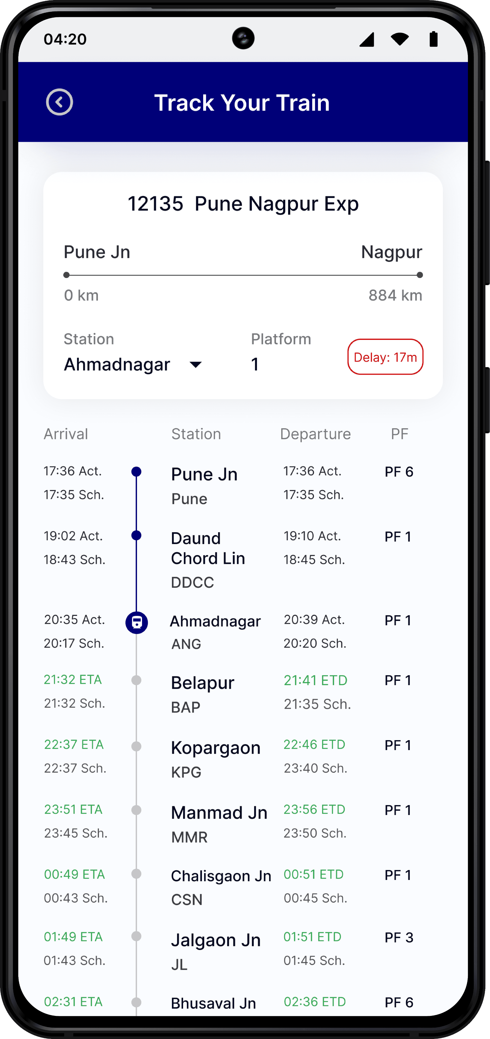
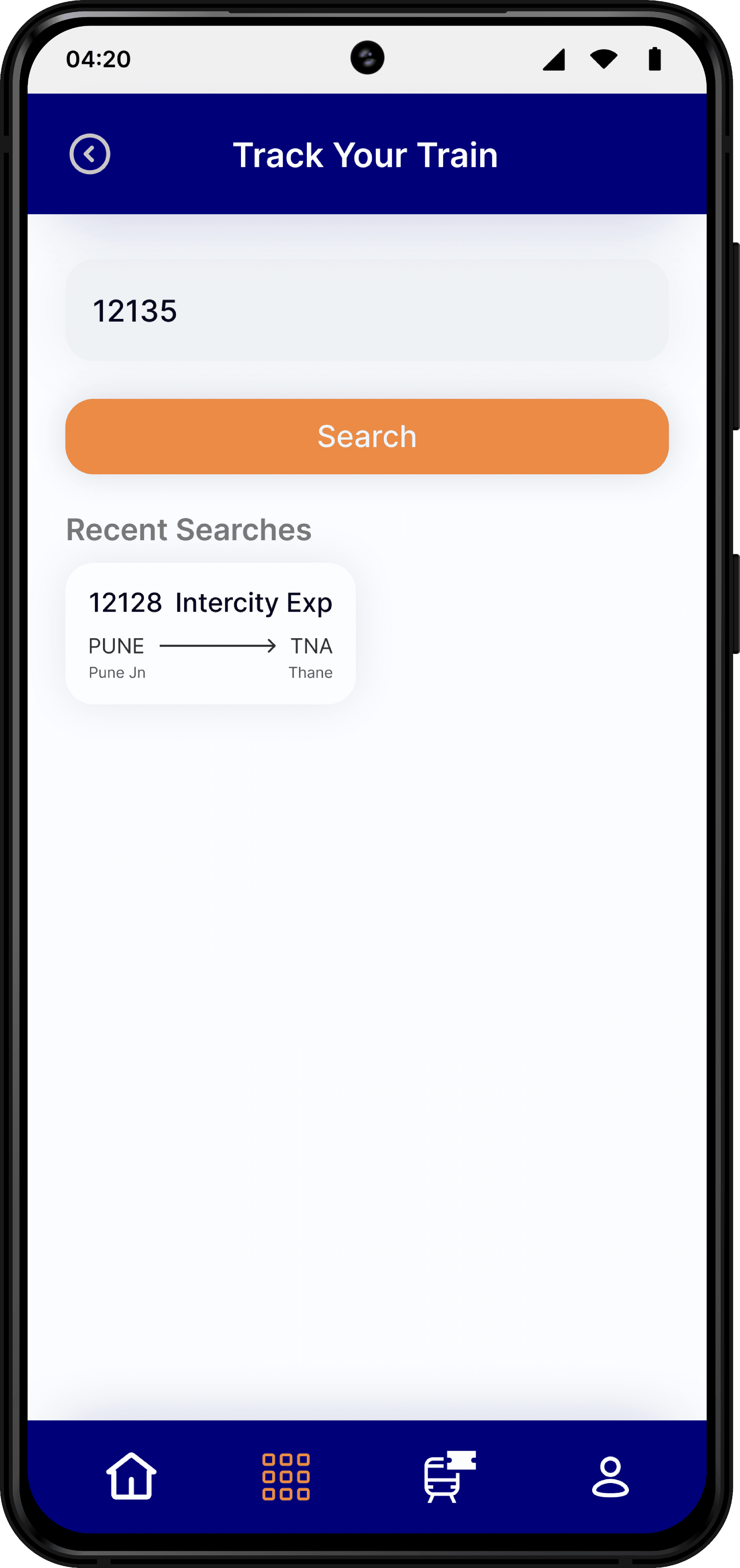
Track Your Train
Users search by train number to view real-time location updates.
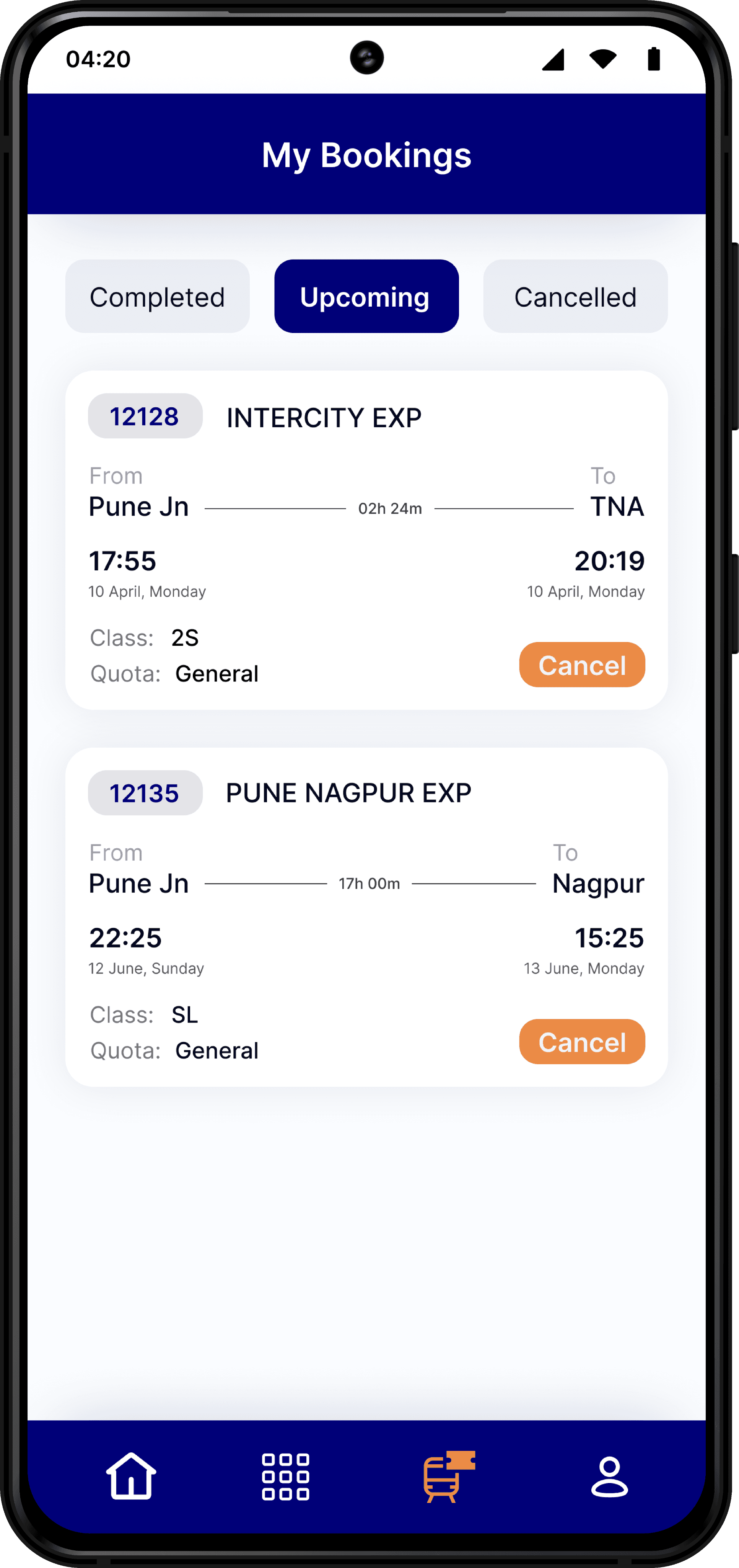
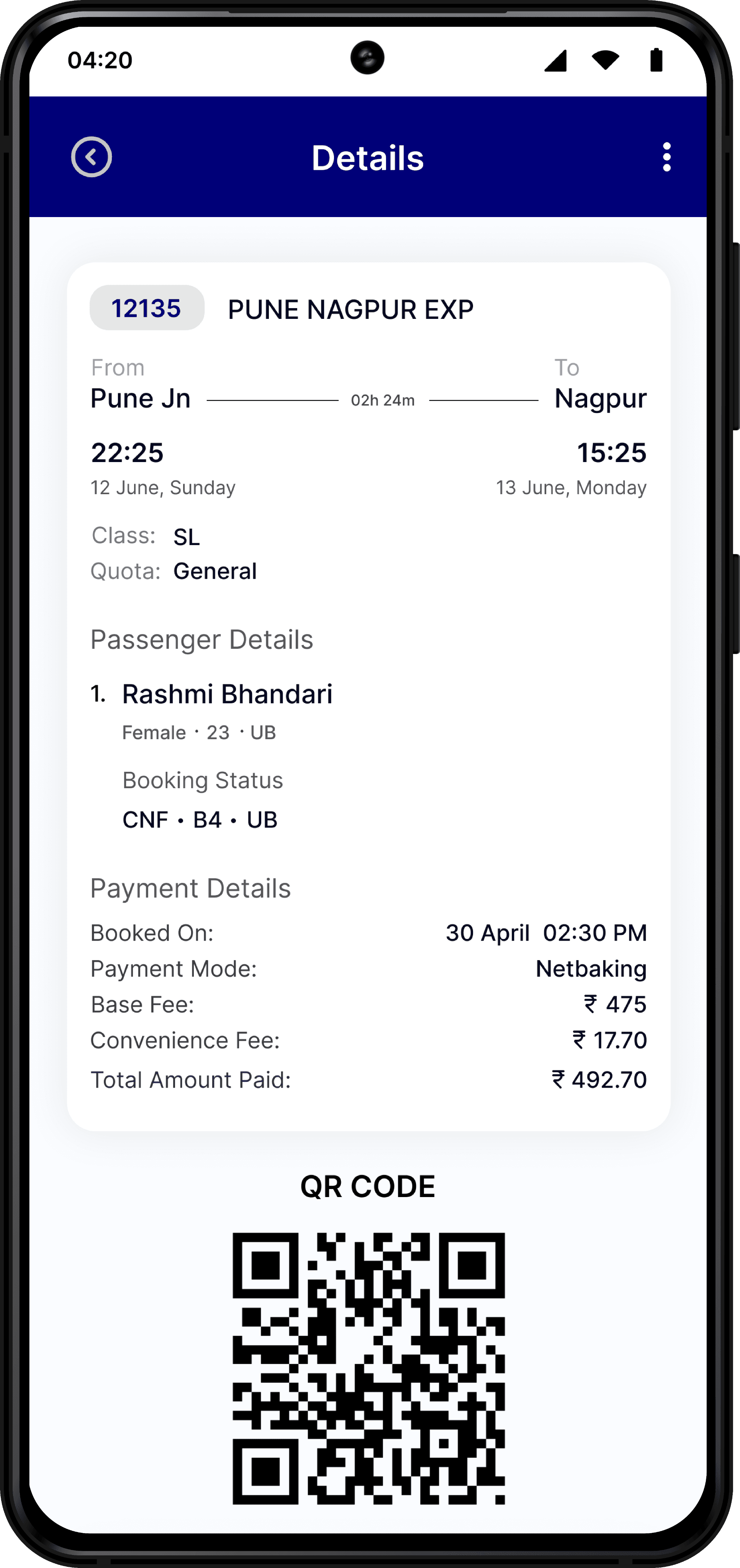
My Bookings
Categorized into:
Completed Bookings
Upcoming Bookings
Canceled Bookings
Problem Identification
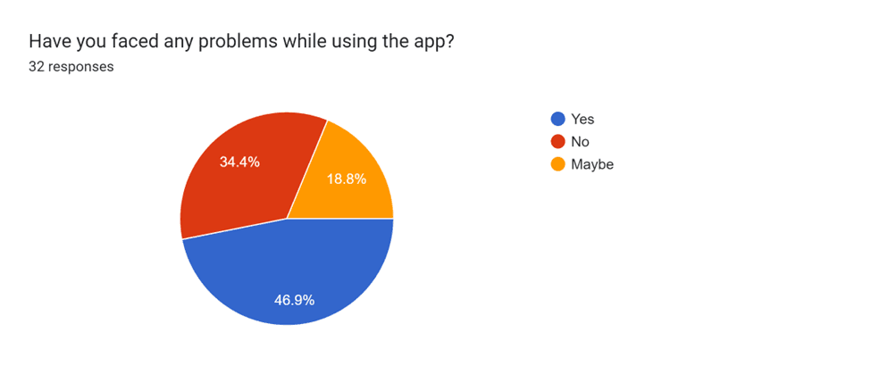
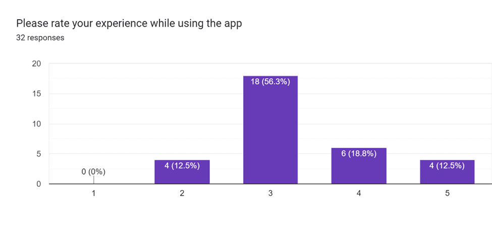
Frequent complaints about the app’s user interface and navigation challenges highlighted a need for a more user-friendly redesign. Key pain points included a tedious booking process, difficulty accessing services like PNR inquiry and ticket tracking, and limited payment options.
Primary Research
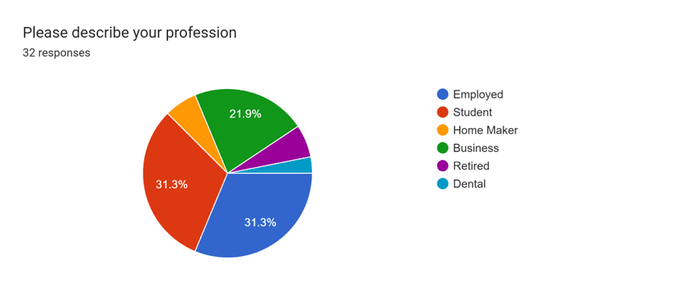
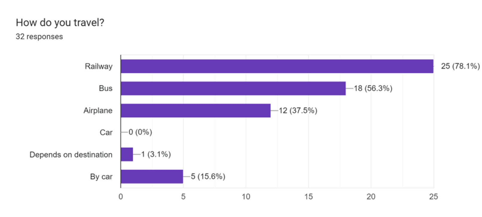
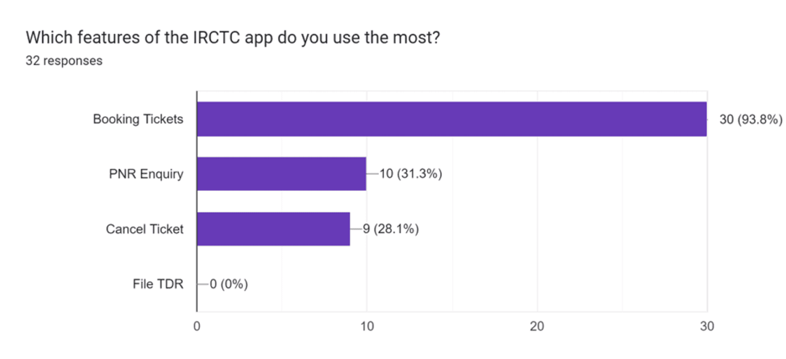
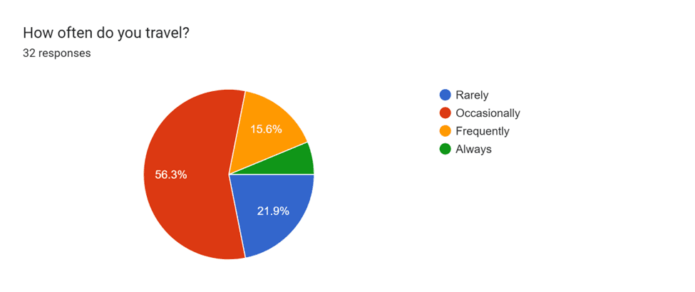
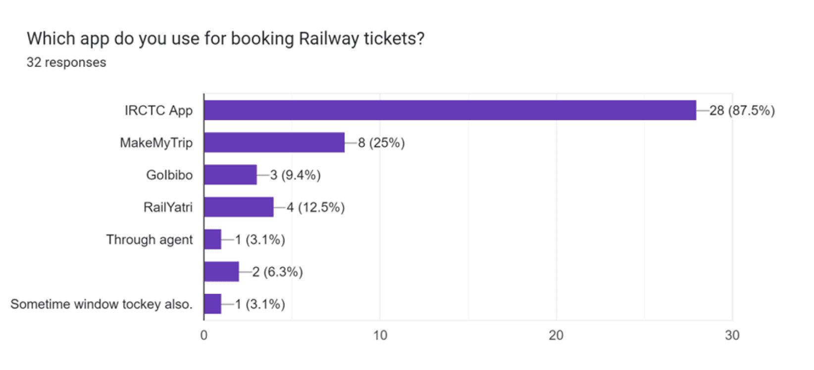
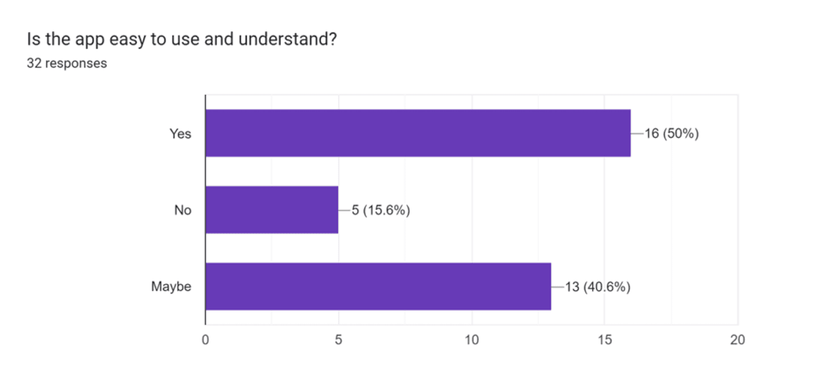
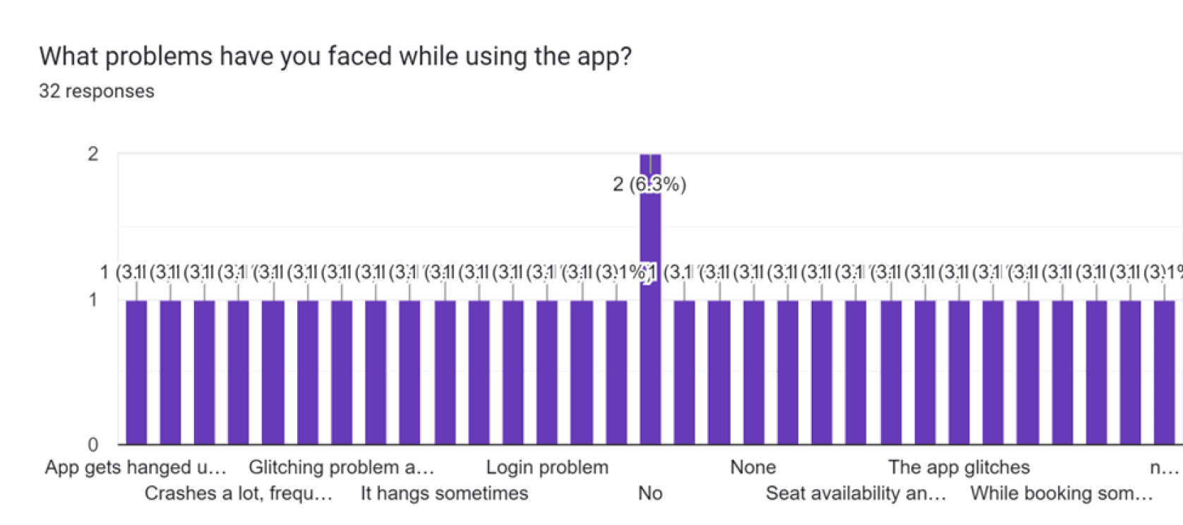
Surveys: Conducted an online survey with 32 participants who used the app frequently. Questions focused on user satisfaction, features they liked/disliked, and desired improvements.
Interviews: Conducted one-on-one interviews with frequent travelers to gain deeper insights into their pain points.
Secondary Research
Heuristic Evaluation


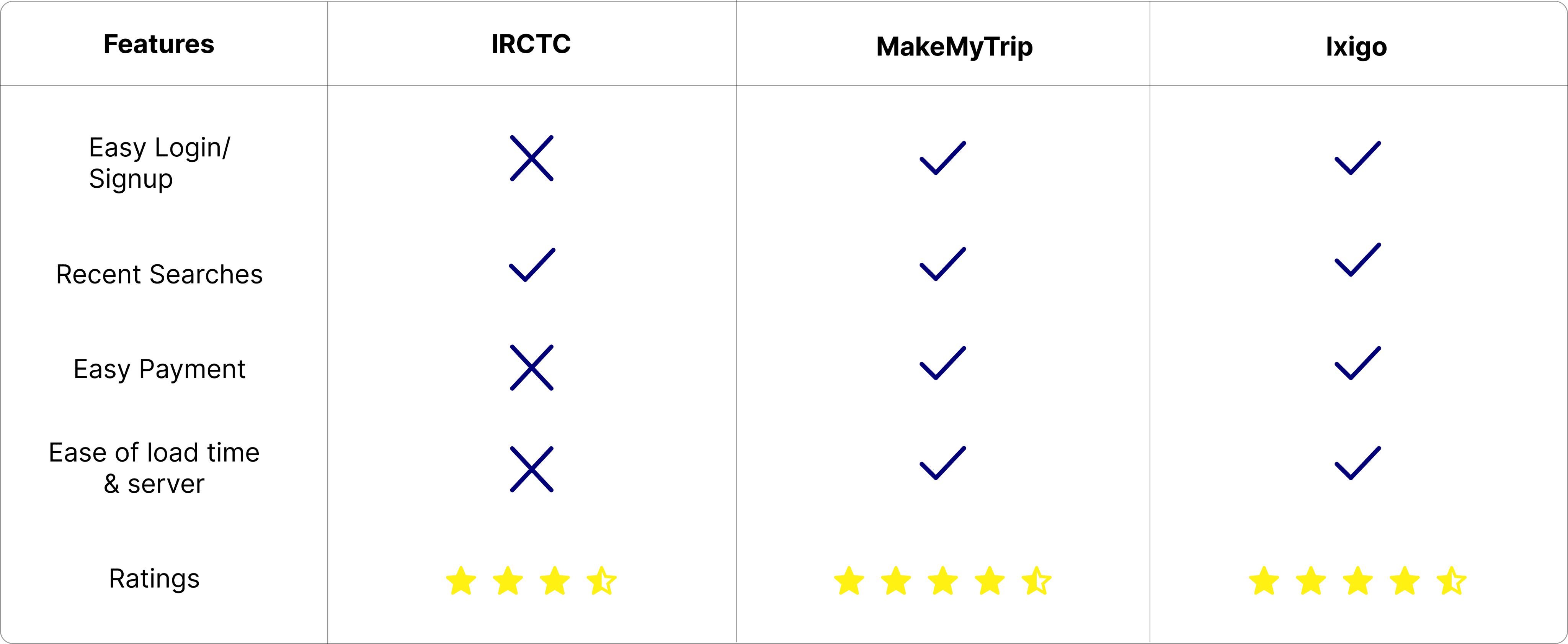
Competitive Study
Insights
The application frequently logs out unexpectedly without any clear reason, disrupting the user experience.
Navigating between different actions is overly time-consuming and cumbersome, leading to frustration among users.
The app's interface lacks user-friendliness, making it difficult for users to complete tasks efficiently.
An excessive number of captchas are required, even for simple processes, adding unnecessary complexity.
The information displayed within the app appears cluttered, overwhelming users and causing confusion and anxiety.
The payment methods offered are poorly structured and difficult to follow, making the transaction process inconvenient.
Define Phase
Persona

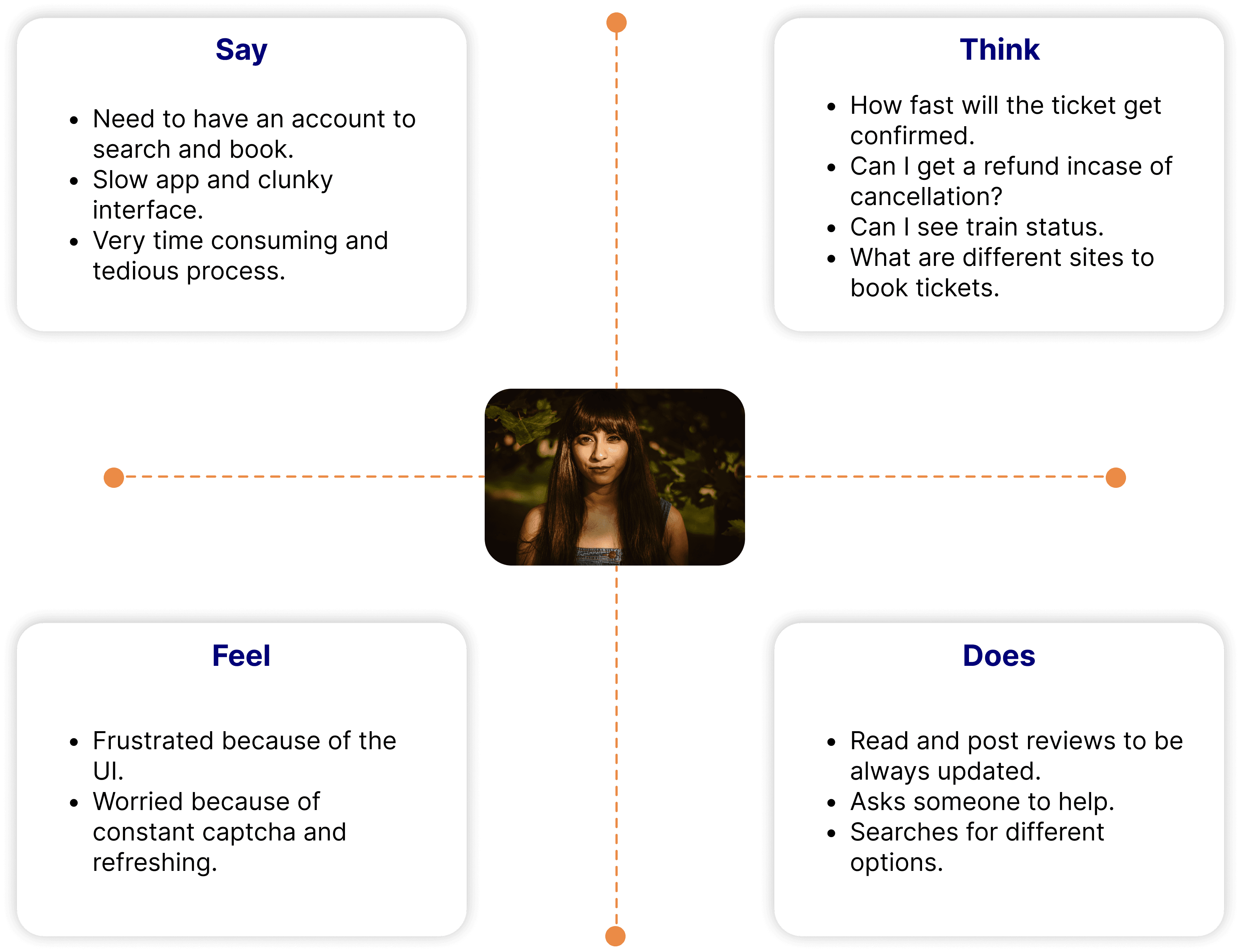
Empathy Mapping
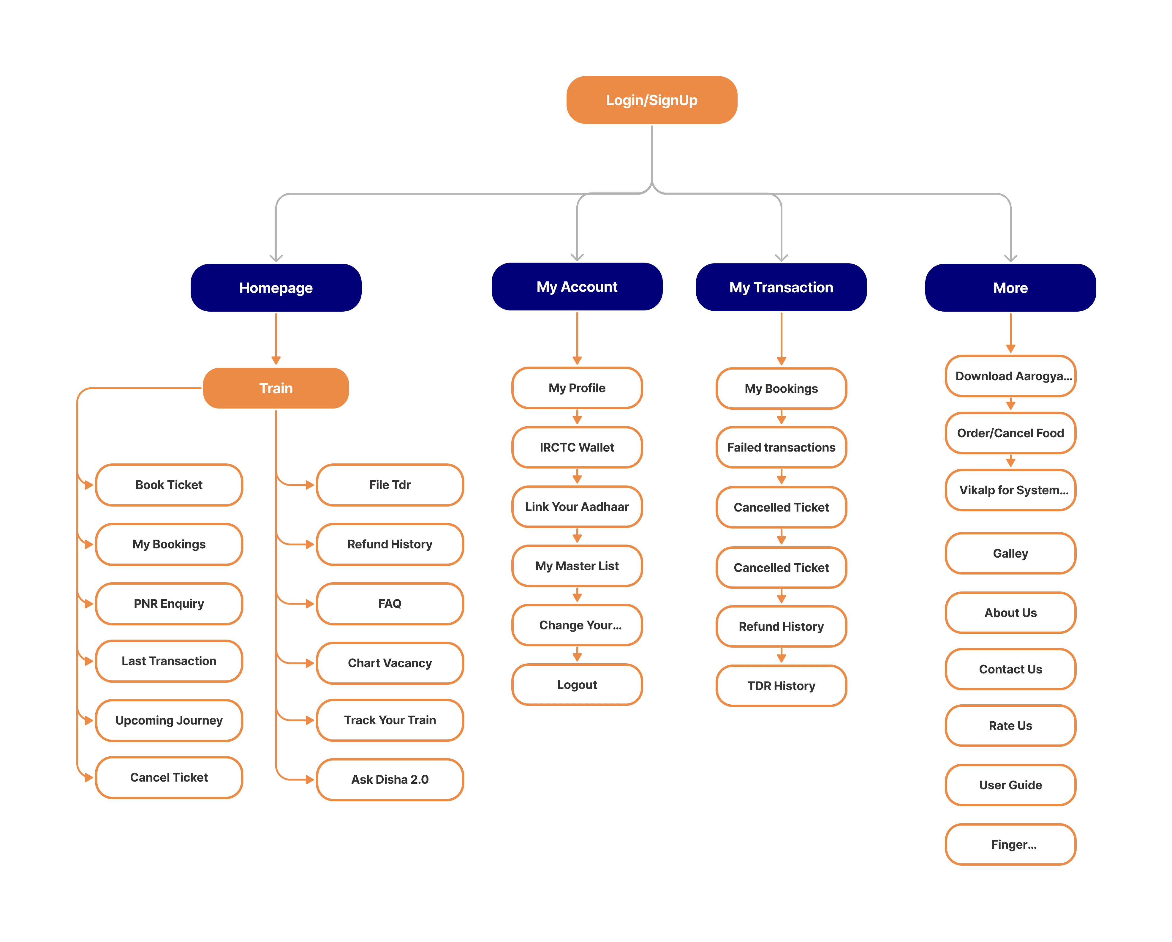
Information Architecture(Before)
Information Architecture(After)
Low Fidelity
Interactive Prototype
Outcomes
Enhanced usability led to increased user satisfaction.
Simplified booking process significantly reduced drop-off rates.
Centralized access to essential services improved overall efficiency.
Conclusion
The redesigned IRCTC app successfully addressed user pain points by simplifying the booking process, centralizing key services, and improving navigation. The project highlighted the importance of a user-centered approach in creating effective solutions. This redesign not only enhanced the app's functionality but also delivered a more satisfying travel experience for millions of users.
