SOMA Spirituality
Where Ancient Rituals Meet Modern Healing

Overview
SOMA is a conceptual spiritual wellness brand that helps individuals reconnect with themselves through mindful journaling, intentional rituals, and beautifully designed products. The project explores how thoughtful branding can transform emotional healing into a calm, approachable, and meaningful everyday experience.
Understanding The brand
The project began by exploring the growing intersection of spirituality, mindfulness, and modern wellness. Existing brands in this space often leaned toward either highly traditional aesthetics or overly commercial wellness trends. The opportunity was to create a visual identity that felt warm, approachable, emotionally grounding, and contemporary.


The Challenge
The presentation needed to communicate SOMA's values while remaining engaging for potential partners, customers, and stakeholders.
• Communicate spirituality without appearing overly traditional
• Build emotional connection through design
• Create a premium yet approachable visual language
• Present multiple products under one cohesive identity
Designing the Brand Deck
Featured Product
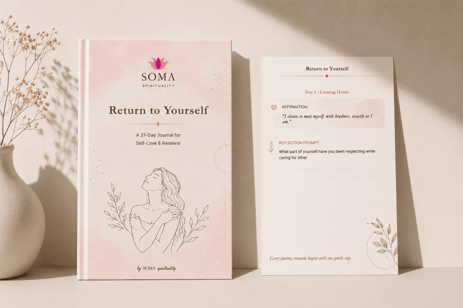
Designing the "Return to Yourself" Journal
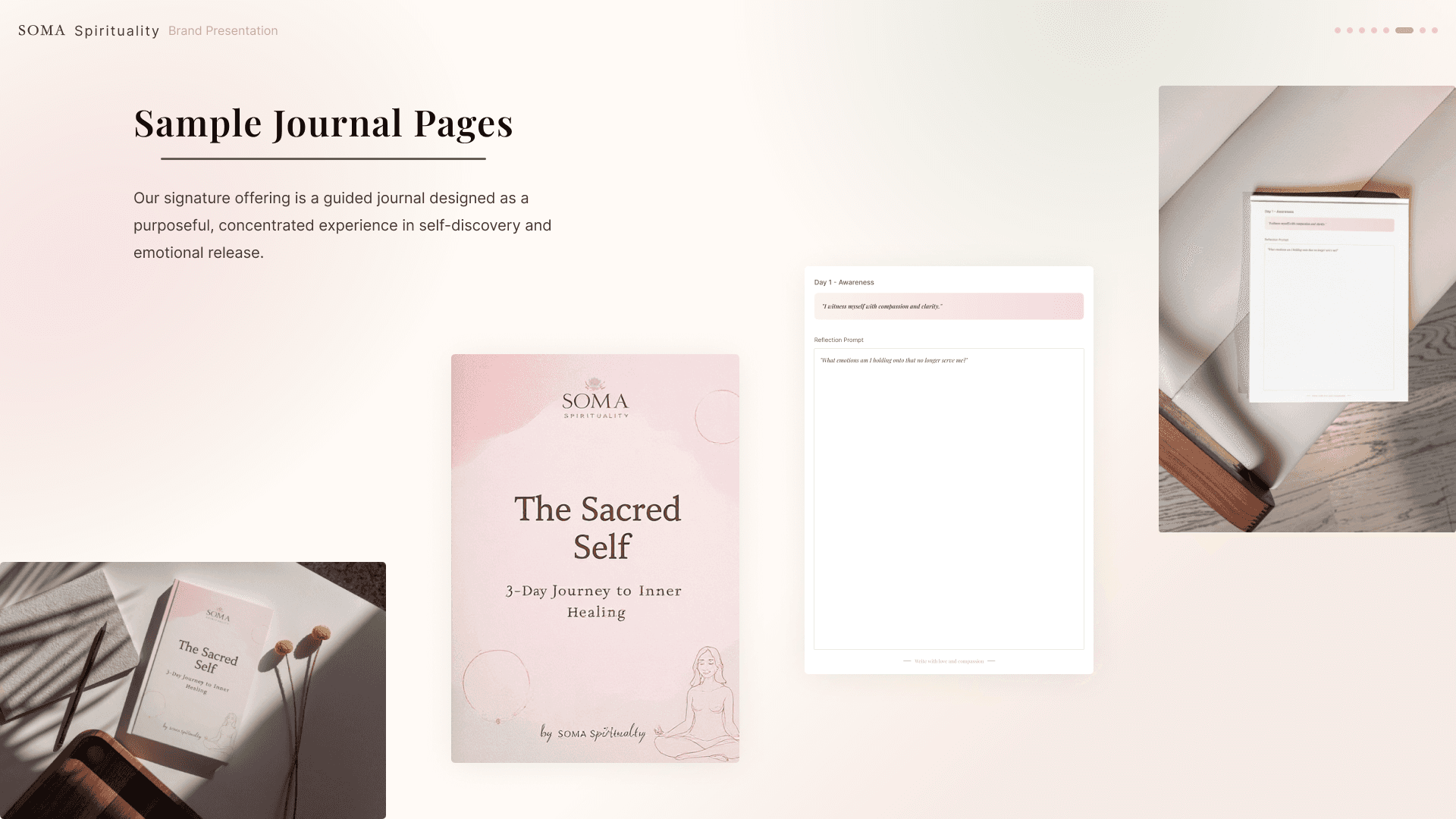
To demonstrate how the brand could translate into a real product, I developed a flagship guided journal titled Return to Yourself.
The concept evolved significantly during the project. Earlier iterations featured a different journal concept, but I refined the presentation so the featured journal aligned consistently with the journal collection and supporting social content. The final version presents a unified narrative around "Return to Yourself" as the hero product, with a 21-day guided experience focused on self-compassion, reflection, and intentional rituals.
Each daily spread combines:
Affirmations
Reflection prompts
Mindful rituals
Journaling space
This helped transform the brand from a visual identity into a tangible user experience.

Product Ecosystem
Expanding Beyond the Journal
To showcase the scalability of the identity, I extended the visual system across a collection of complementary products.
These included:
Business Card
Scented Candle
Bookmark
Tumbled Stone Pouch
Each product was designed using the same visual language, ensuring consistency across packaging, typography, and brand expression.


Social Media
Building a Consistent Digital Presence
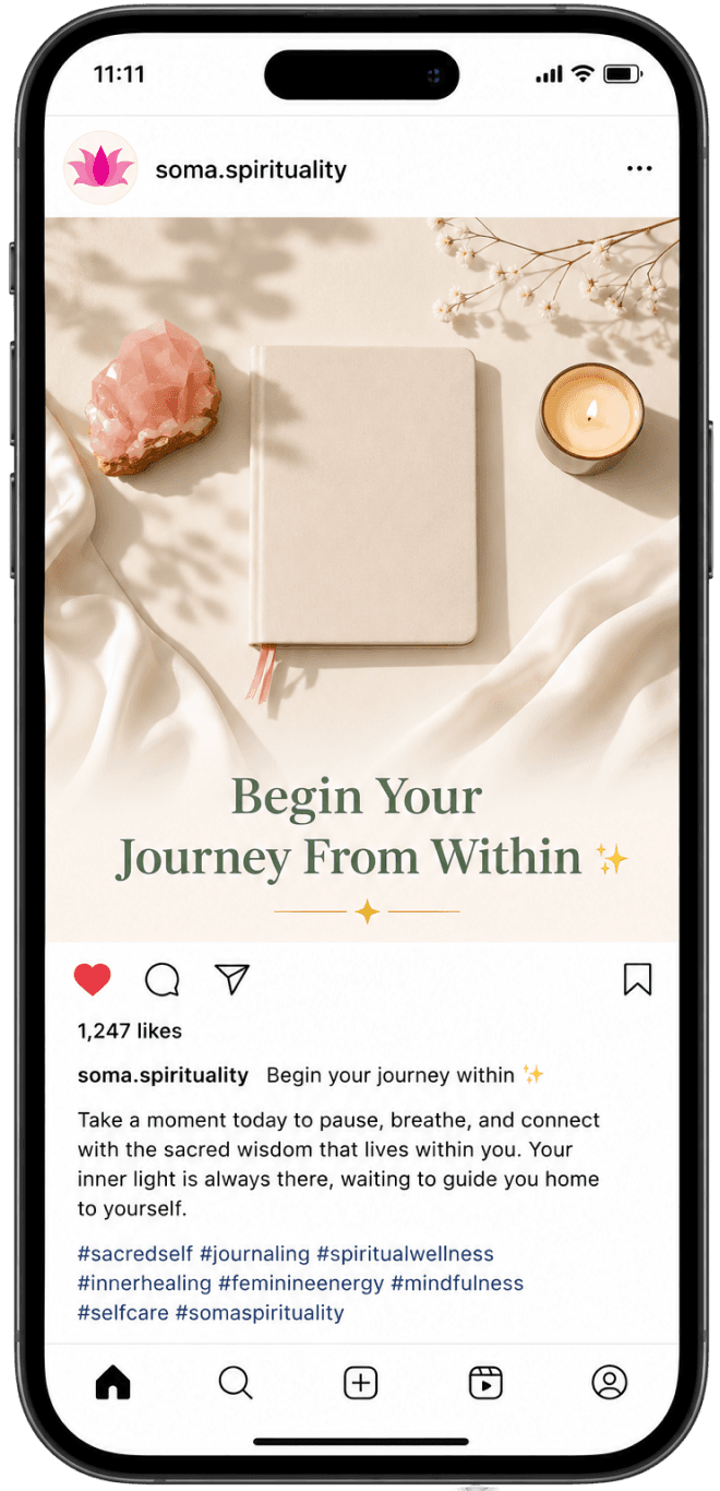
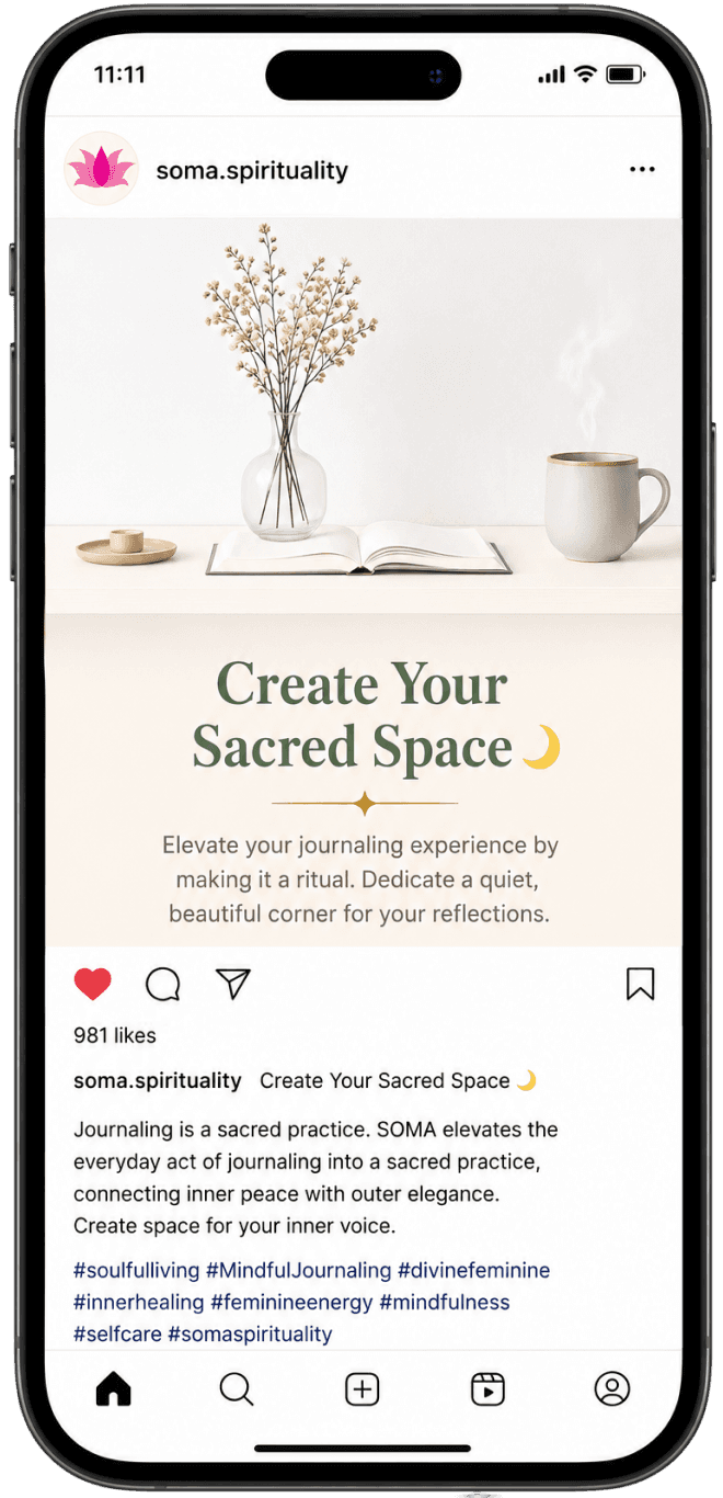
The final stage of the project explored how SOMA could communicate online.
Three social media concepts were designed to maintain a calm, editorial aesthetic while reinforcing the brand's messaging around mindfulness and emotional wellbeing. These concepts demonstrate how the visual identity adapts across digital touchpoints while remaining cohesive with the overall brand system.

Design Process & Iterations
Refining the Experience
One of the most valuable aspects of this project was the iterative refinement process. Rather than settling on the first concept, I continuously improved the presentation to strengthen consistency and storytelling.
Key refinements included:
Restructuring the presentation to create a smoother narrative flow.
Refining the brand story, vision, and mission for clarity and emotional impact.
Updating the typography system to improve readability and establish a stronger editorial feel.
Revising the color palette to introduce a richer primary brand color that better reflected warmth and feminine energy.
Rewriting the journal concept page so its affirmations and reflection prompts aligned with the actual journal design.
Designing a cohesive collection of branded products that extended the identity beyond the core journal.
Creating realistic lifestyle mockups to present the brand in authentic, premium contexts rather than isolated product renders.
Expanding the social media section with an additional post to create a more balanced and believable content series.
Fine-tuning spacing, hierarchy, iconography, and visual rhythm across the deck to improve readability and presentation quality.
This iterative approach transformed the project from a visual identity exercise into a polished brand presentation that communicates both strategy and execution.



Deliverables
Final Deliverables
Brand Story
Vision & Mission
Logo & Identity
Color Palette & Typography
Featured Journal Concept
Journal Collection
Product Ecosystem
Social Media Concepts
Brand Deck Presentation
Reflection
This project strengthened my ability to think beyond individual visuals and design complete brand experiences. It reinforced the importance of aligning strategy, storytelling, and visual execution while iterating based on feedback to achieve a cohesive outcome.
More importantly, it taught me how presentation design can elevate a brand by communicating not only what it looks like, but also what it stands for and how it connects with its audience.
Outcome
The final brand deck establishes a clear strategic and visual foundation for SOMA Spirituality, translating abstract values such as mindfulness, emotional healing, and intentional living into a cohesive, presentation-ready identity. The project demonstrates my ability to combine brand strategy, visual identity, product thinking, and storytelling into a single, unified design solution.